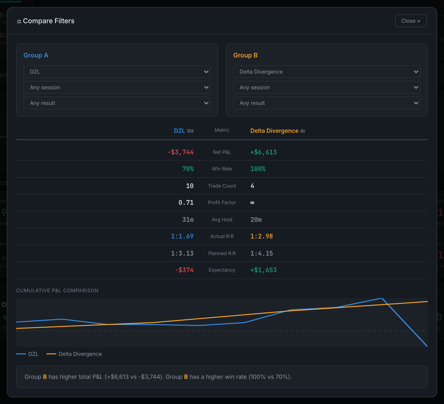
What does Compare actually show me?
Eight metrics per group in a facing-columns table, both equity curves drawn on one chart, and a written verdict naming the stronger group.
The layout is deliberately symmetrical — Group A's value on the left, the metric name down the middle, Group B's value on the right — so a difference is a thing you see rather than something you calculate.
The metrics compared:
- Net P&L, coloured green or red per group
- Win rate, colour-graded
- Trade countRead this one first, for the reason below
- Profit factorShown as ∞ for a group that has not lost yet, which is a sample-size statement rather than a performance one
- Average hold time
- Actual R:R and planned R:R, side by side, so the gap between intention and outcome shows up per group
- Expectancy per trade
Under the table, cumulative P&L comparison draws both groups' equity curves on one set of axes. Two curves ending at a similar place can have got there very differently, and that is usually the more useful finding.
At the foot, a verdict names which group has the higher total P&L and the higher win rate. It is willing to decline: "Groups are too similar to determine a clear winner."
Three things worth knowing:
- Both groups inherit the period and asset filters from the row above. Compare narrows within whatever you already have selected; it does not escape it.
- The trade counts are the honesty check. A group of four trades will happily report a 100% win rate, an infinite profit factor, and win the verdict against a ten-trade group. The counts sit in both column headers for exactly this reason, and the picture below is that case: Group B wins on every line and has fewer than half the trades behind it.
- It tells you when a group is empty"Group A has no trades", or "Both groups have no trades — adjust filters" — rather than drawing a comparison against nothing.