What is each of the six Analytics tabs for?
Overview scores you, Edge finds what works, Execution grades how you traded it, Risk measures what it costs, Psychology reads your state, and Reports exports it.

Everything you have logged, scored and cut apart. The Journal is the record; Analytics is where it gets read back to you — which setups actually pay, where your execution leaks money, how much risk you are really running, and what your own state has to do with any of it.
It is bigger than it first looks, and it is worth understanding the shape before hunting for a particular number.
There are six tabs across the top — Overview, Edge, Execution, Risk, Psychology and Reports — and each tab is not one screen but a strip of sub-pages you page through. Risk alone has fifteen. The sub-page strip sits directly under the tabs, and under it a one-line hint telling you what that sub-page holds.
Sharing that top line, at its right-hand end, are four controls that apply to every tab: All assets, All time, Filters and Compare. Whatever you narrow to applies to the whole page, so a number on the Risk tab is always describing the same set of trades as the number you just read on Edge. Compare is the odd one out — rather than narrowing the page it opens two groups side by side, and it has its own guide below.
No questions on this page match that. Search all 15 areas
Overview scores you, Edge finds what works, Execution grades how you traded it, Risk measures what it costs, Psychology reads your state, and Reports exports it.
Each tab has a strip of sub-pages under it. Click one to switch. Risk has fifteen, Execution ten, Edge nine, Psychology six, and Overview two. Reports has none — it is one screen.

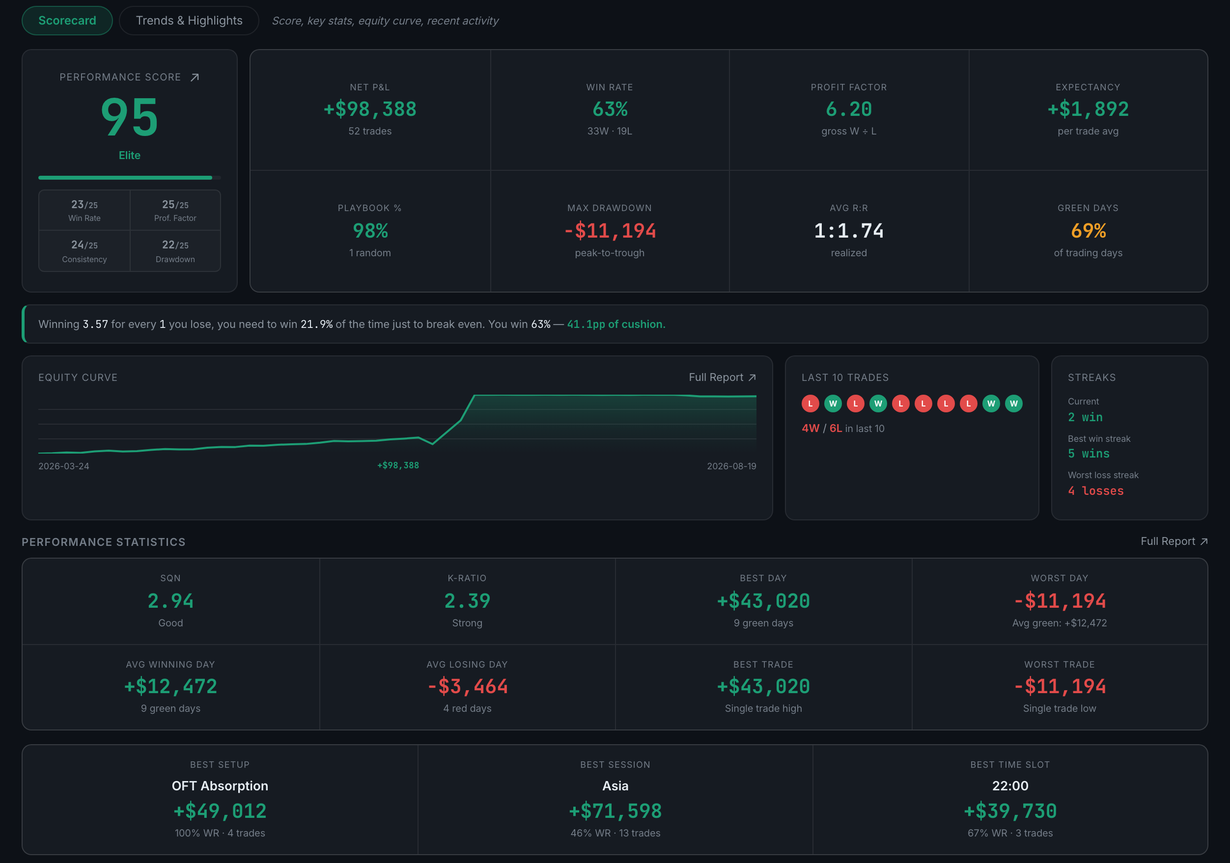
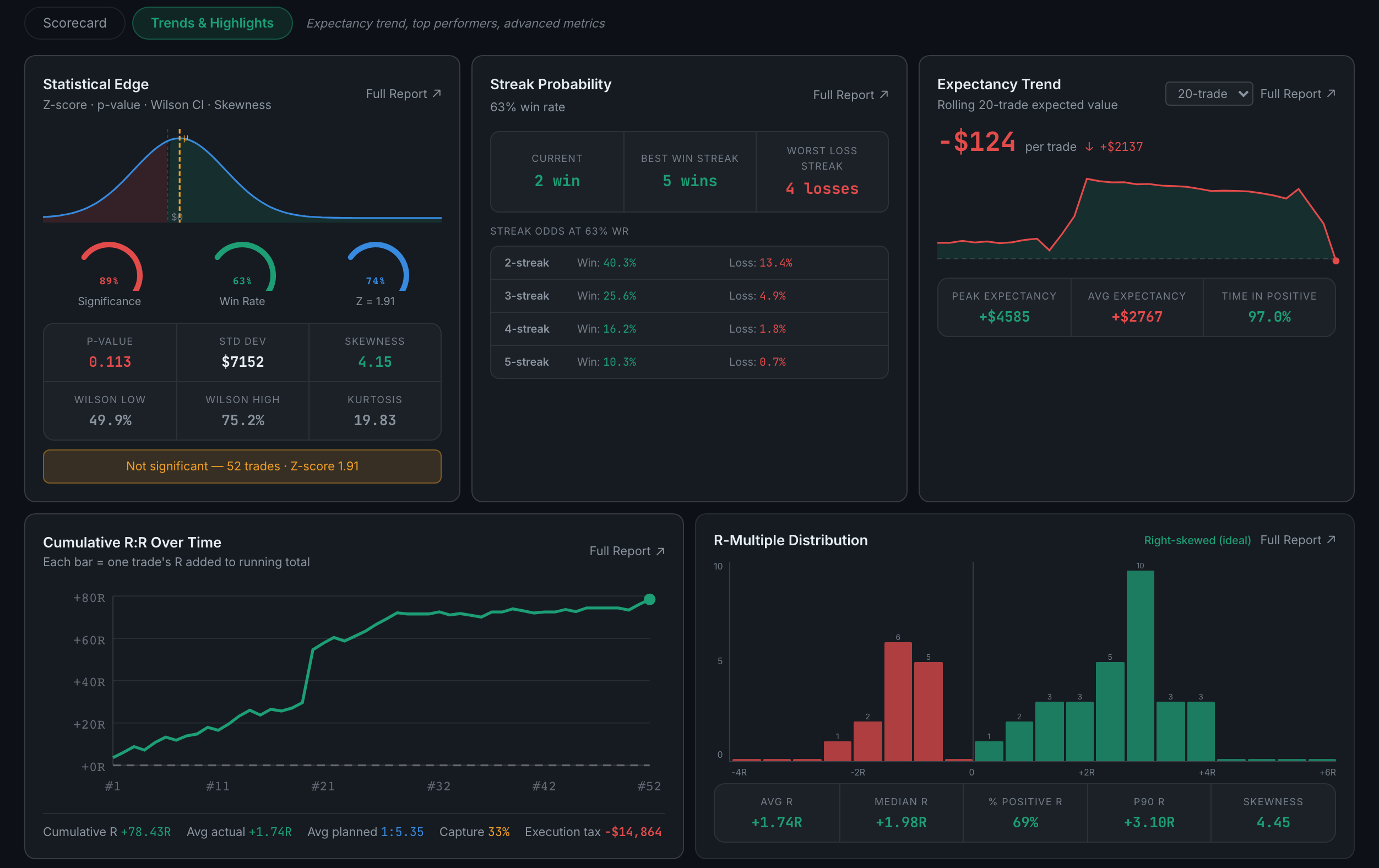
Two sub-pages. Scorecard holds your 0–100 score, the headline stats and the equity curve; Trends & Highlights holds the expectancy trend, your top performers and the advanced metrics.
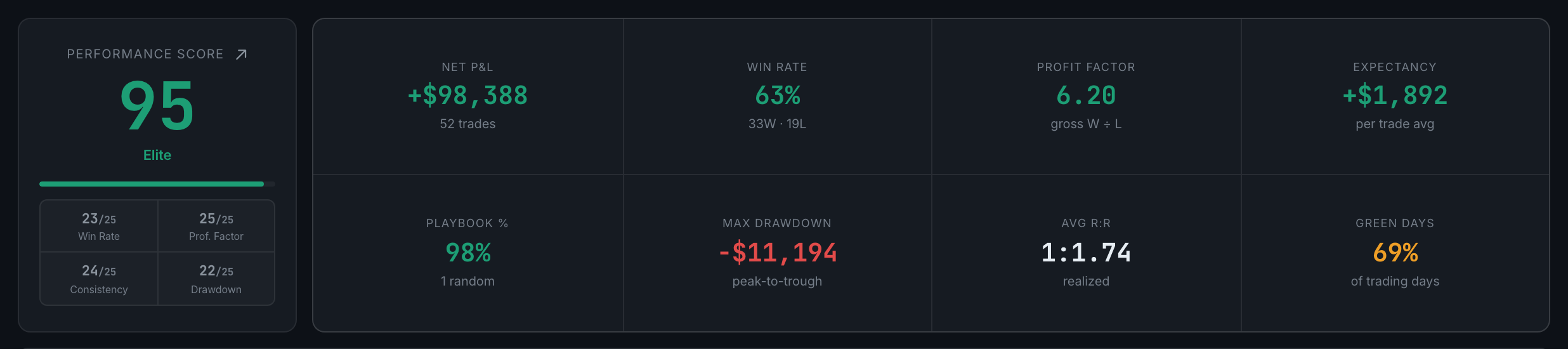
Nine sub-pages, all answering "what actually works" — by setup, session, instrument, account, custom column and news event.

Ten sub-pages about how you traded, not what you traded: entries, exits, hold time, mistakes, and the Process Grade.

Fifteen sub-pages — the largest tab. Drawdown, risk-adjusted return, sizing, commissions, prop firm limits and simulations.

Six sub-pages built from your debriefs and check-ins rather than your fills — your mental state set against your results.
Read the full guideThe row above the tabs — All assets, All time and Filters — narrows every tab at once. Same idea as the Journal's filters, applied to the charts instead of a list.
Across tabs, all of them. Between visits, the period, asset, instrument and setup come back; session and result do not.
Read the full guideAlmost always the filter row or a field you have not been filling in — not a broken chart.
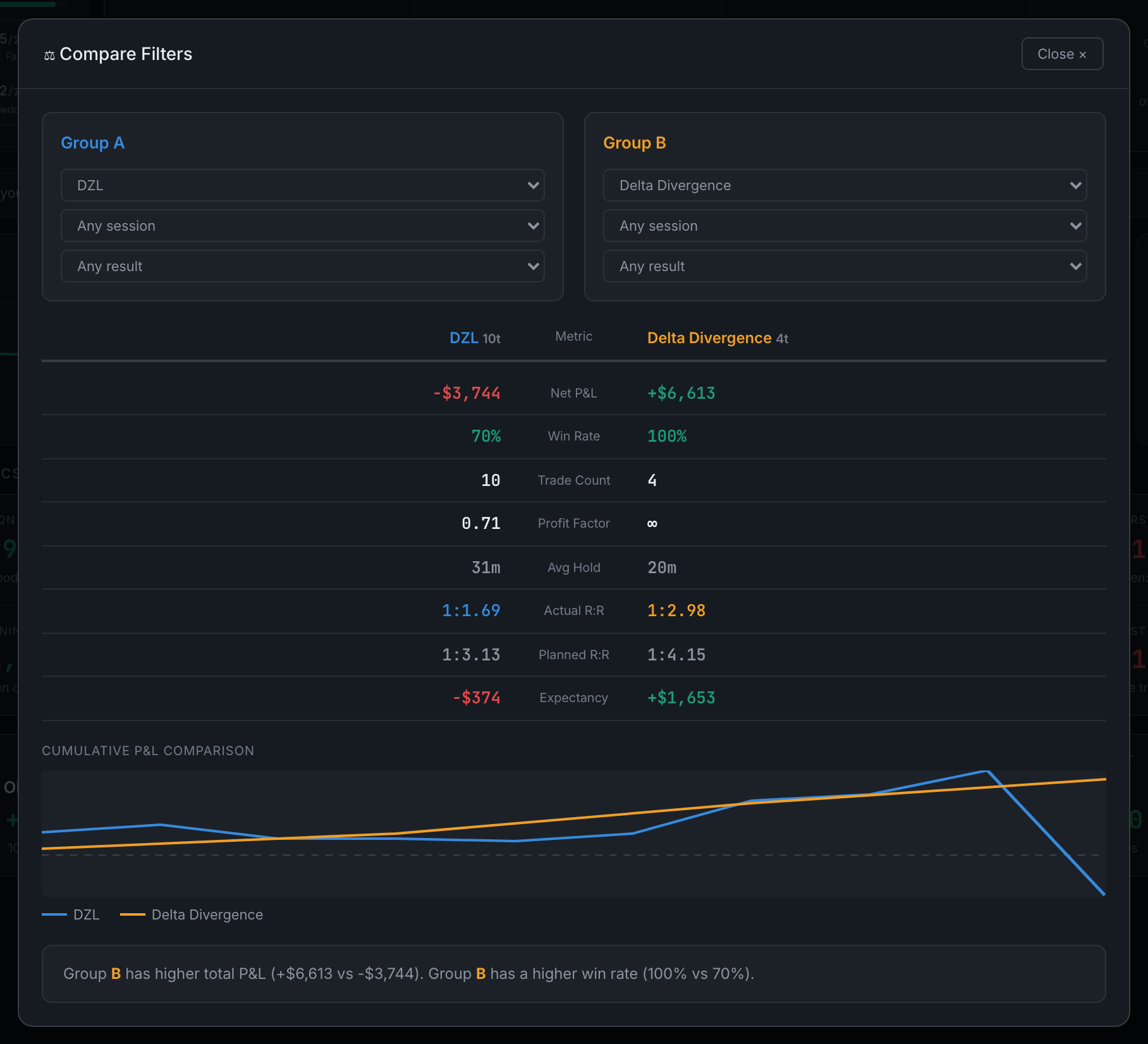
Read the full guideIt puts two slices of your own record side by side — two setups, two sessions, or winners against losers — and shows the same eight figures for each, with a verdict at the bottom.

Eight metrics per group in a facing-columns table, both equity curves drawn on one chart, and a written verdict naming the stronger group.
Your 0–100 Performance Score with the four components that make it, the headline stats grid, the break-even honesty line, your equity curve and your recent trades.
Whether your edge is improving — expectancy over time, cumulative R:R, the R-multiple distribution, statistical edge confidence and streak probability.
A 0–100 score built from four components worth 25 each — win rate, profit factor, consistency and drawdown.
At risk (0–34), Early stage (35–49), Developing (50–64), Strong (65–79), Elite (80–100).
Read the full guideThe win rate you would need, given how much your winners make relative to your losers, just to break even — and how far above or below it you actually are.

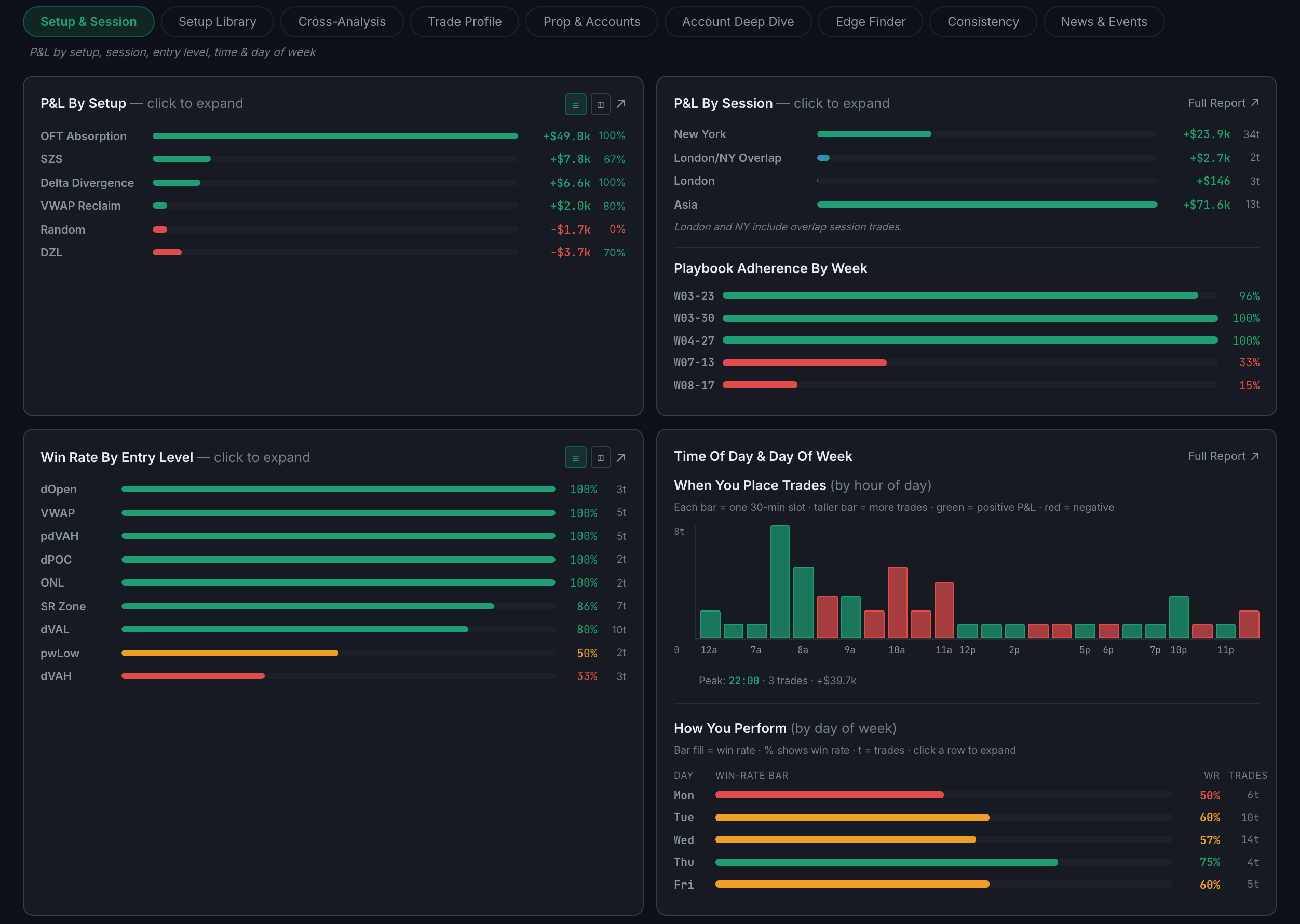
The four basic cuts of "what works" — P&L by setup, by session, by entry level, and by time of day and day of week.
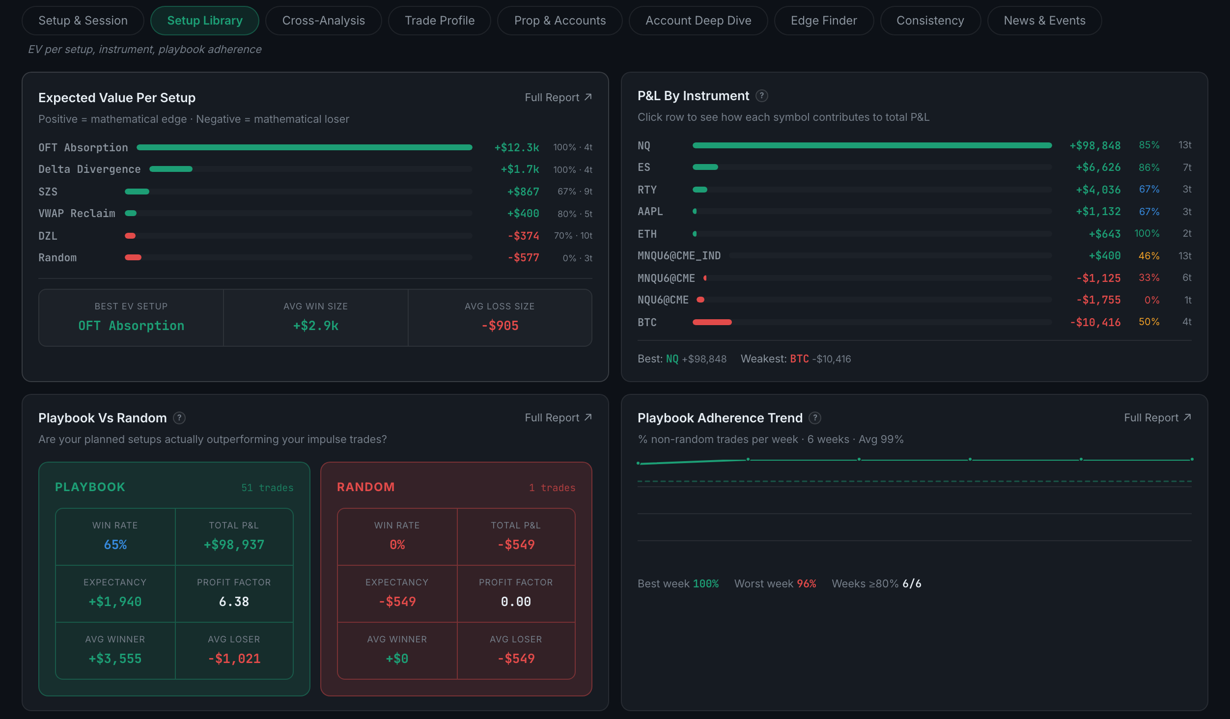
Expected value per setup and per instrument, and the honest test of whether your playbook is doing anything — your playbook trades measured against your off-book ones.
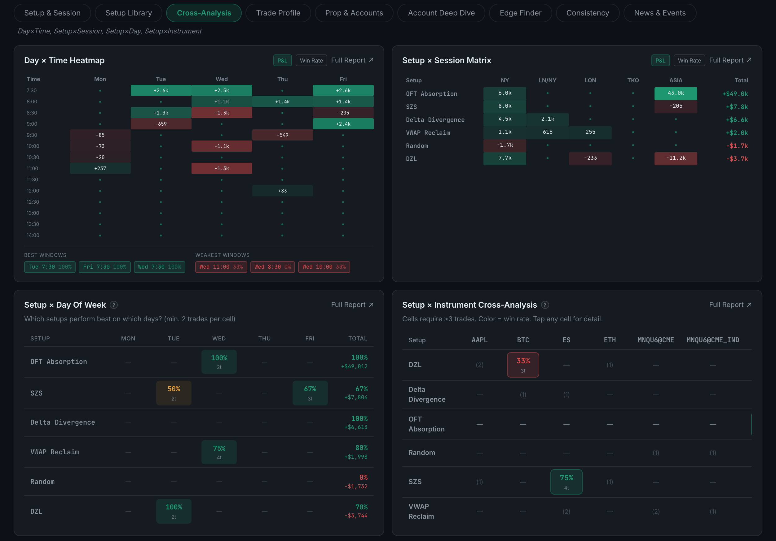
Four matrices that take two dimensions at once — day × time, setup × session, setup × day of week, and setup × instrument.
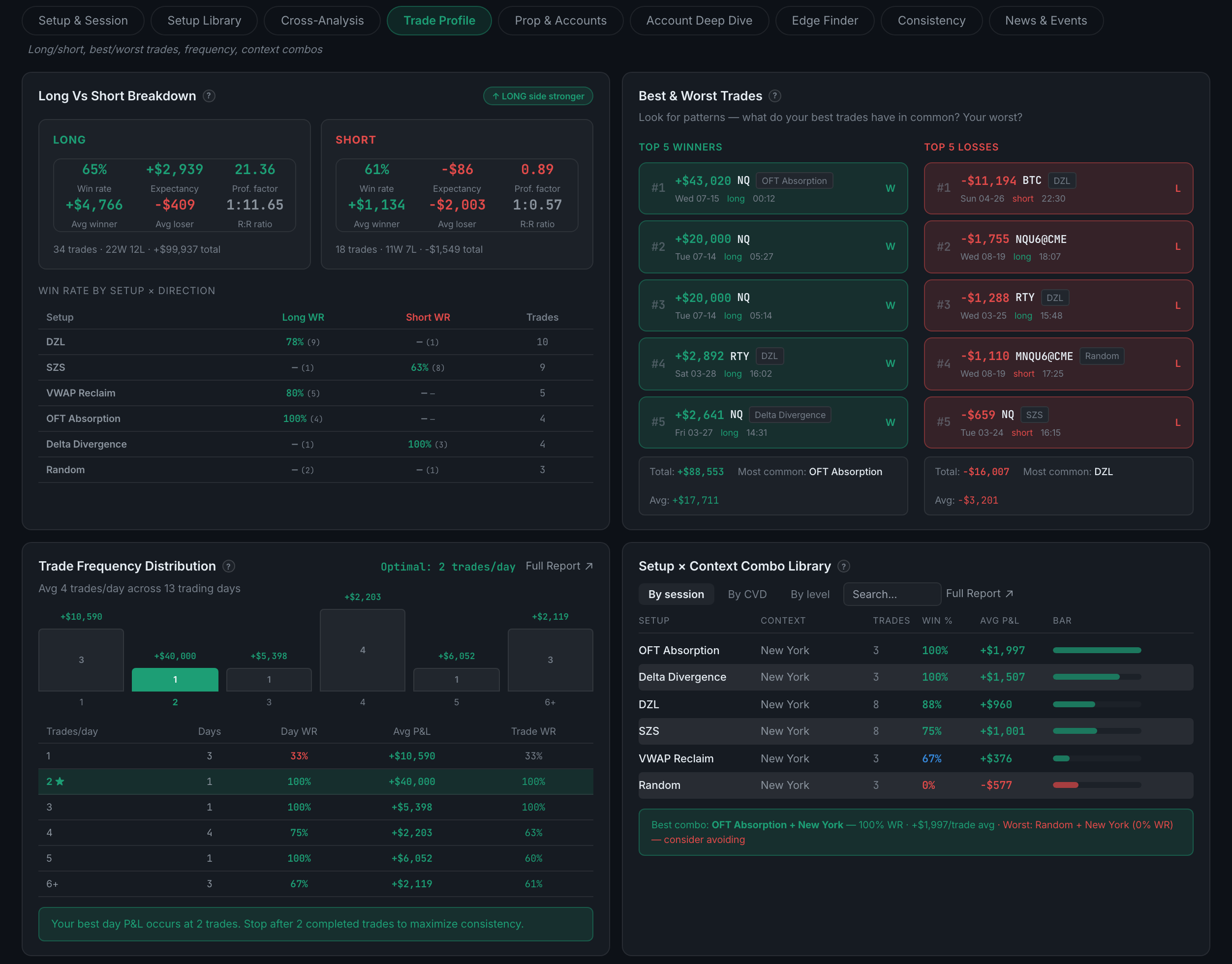
The shape of how you trade — long against short, your five best and five worst trades, how often you trade, and which context combinations keep recurring.
One panel — a side-by-side comparison of every account you trade, sorted by net P&L.
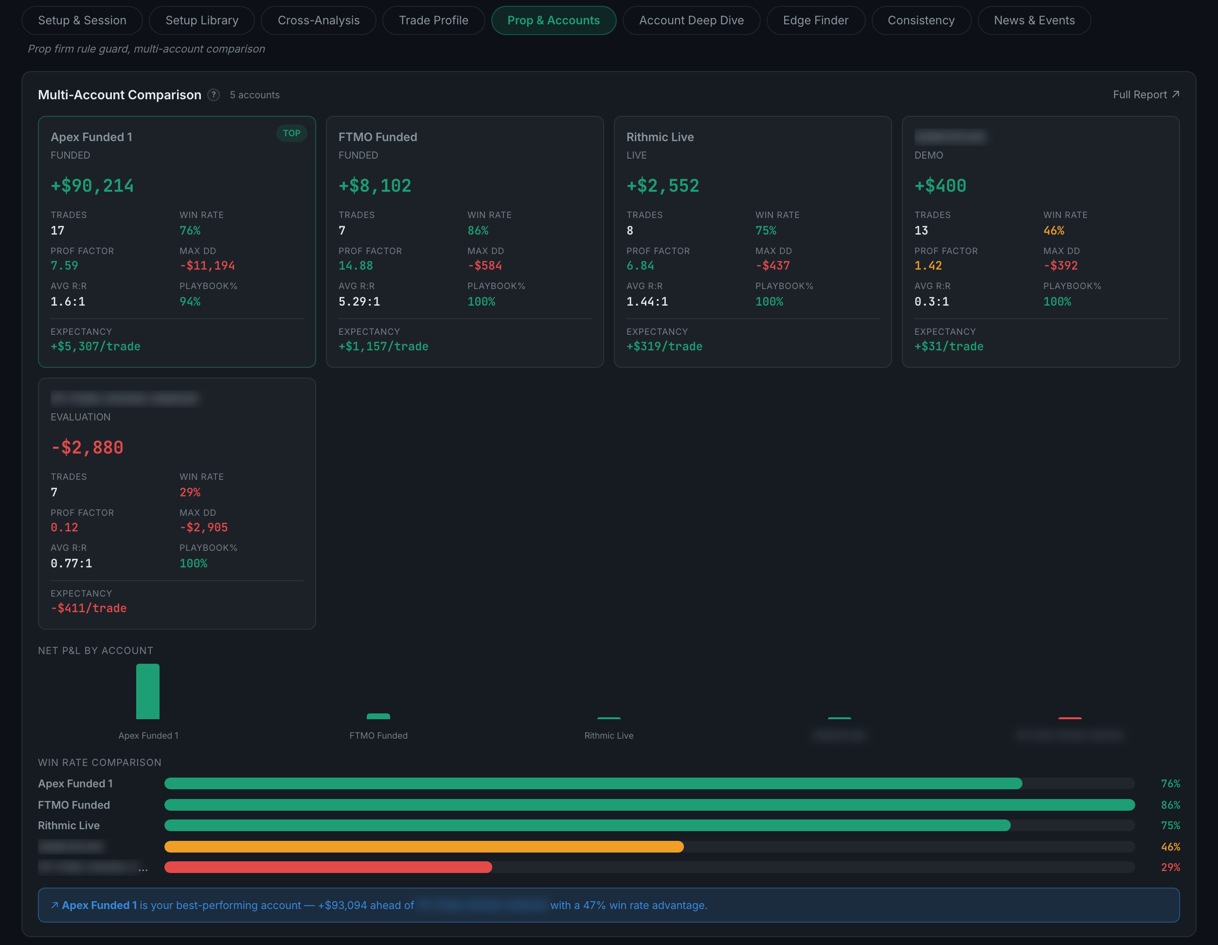
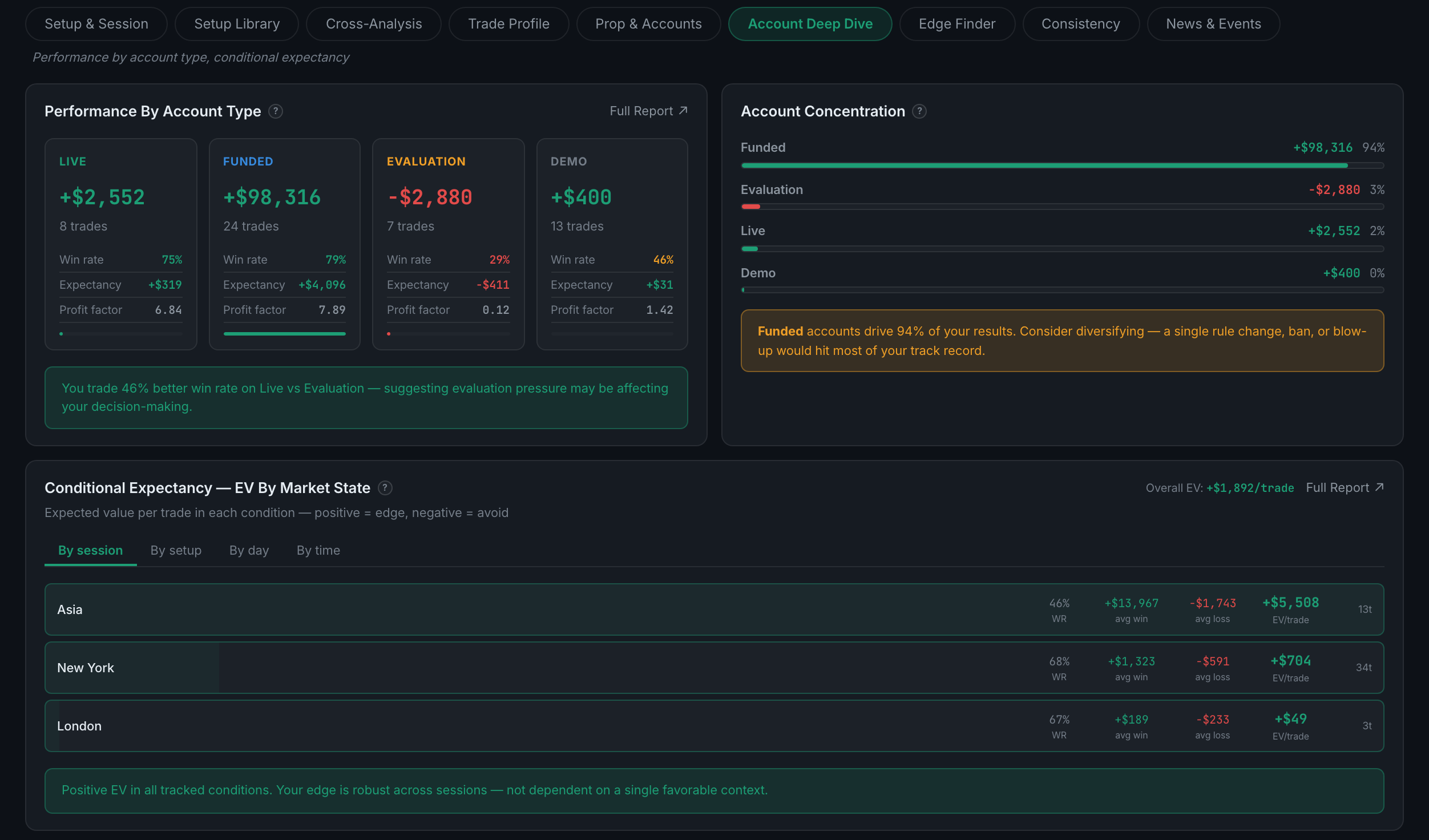
Performance by type of account rather than by individual account, plus concentration and conditional expectancy.
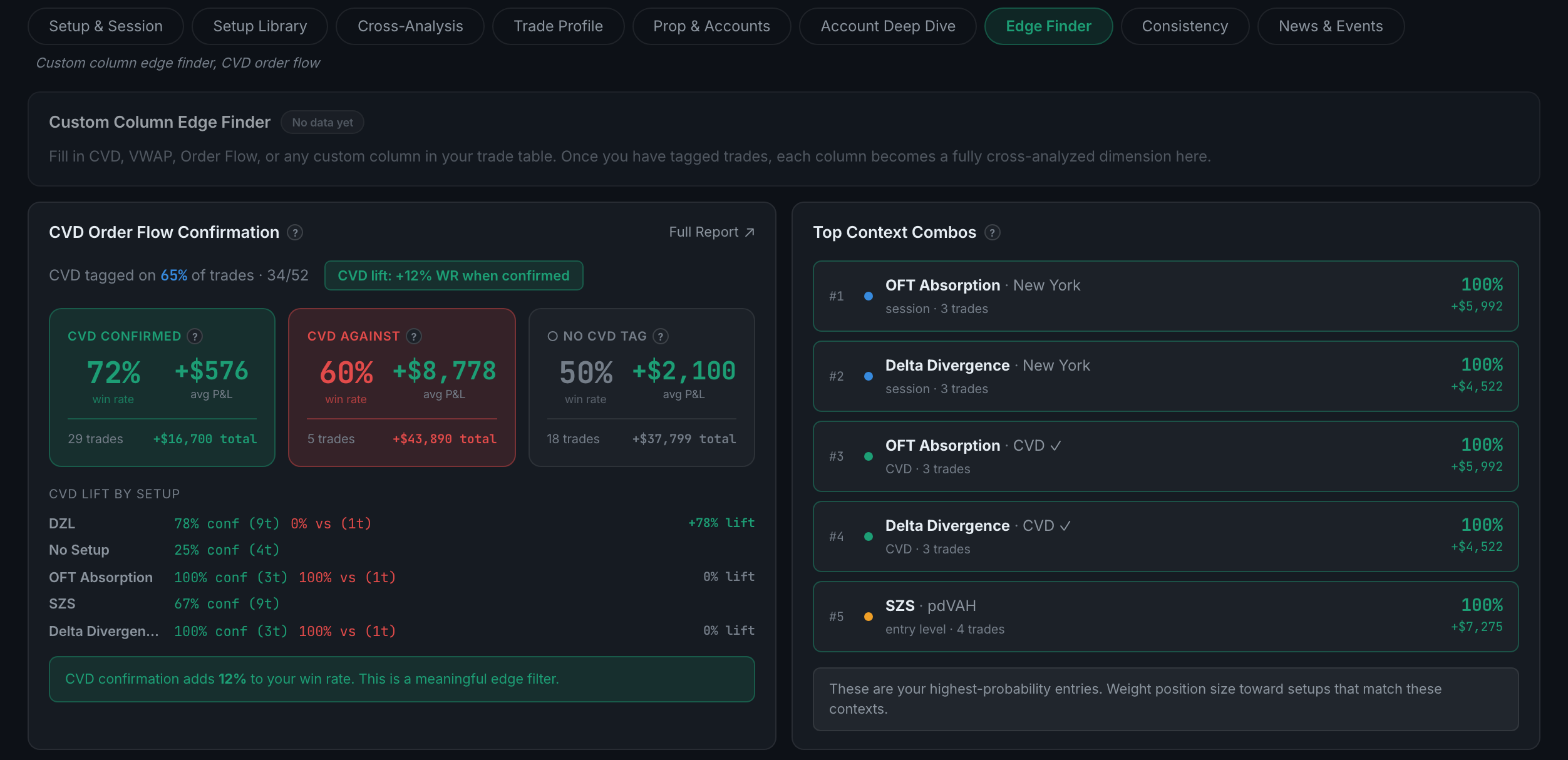
It runs your own custom columns against your results looking for an edge you never named, and adds CVD order flow confirmation.
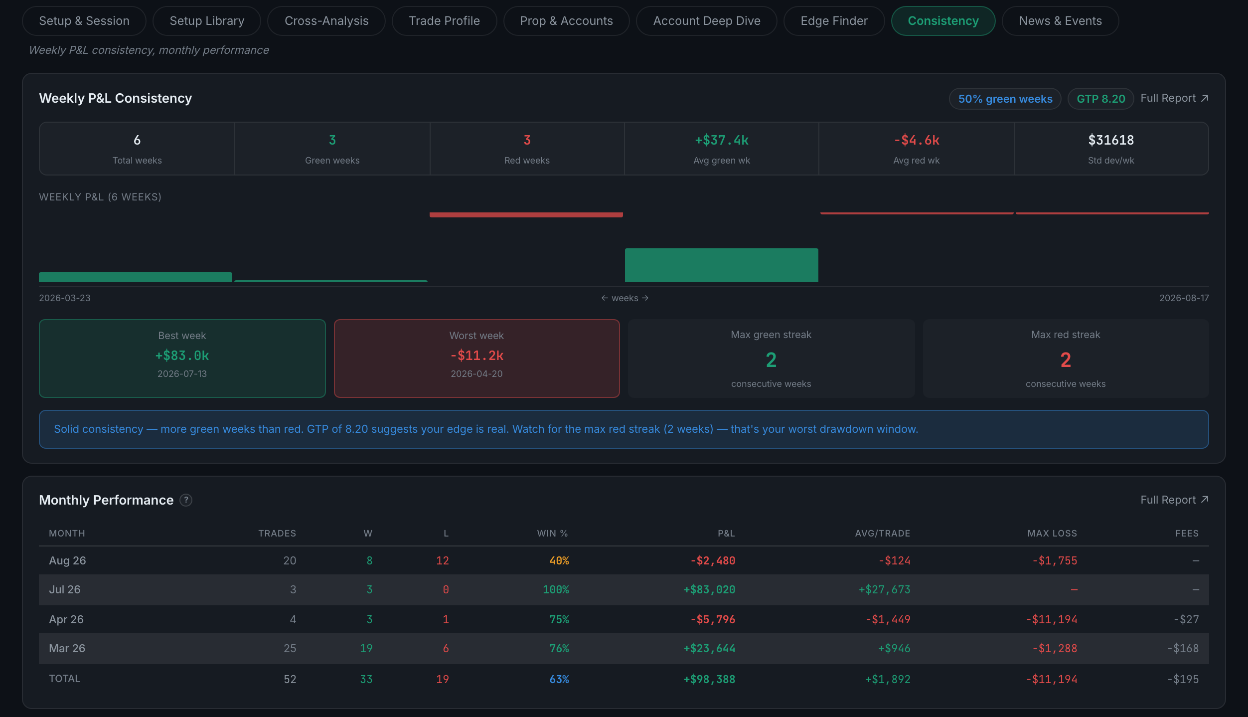
Whether your P&L arrives steadily or in lumps — weekly consistency and monthly performance.
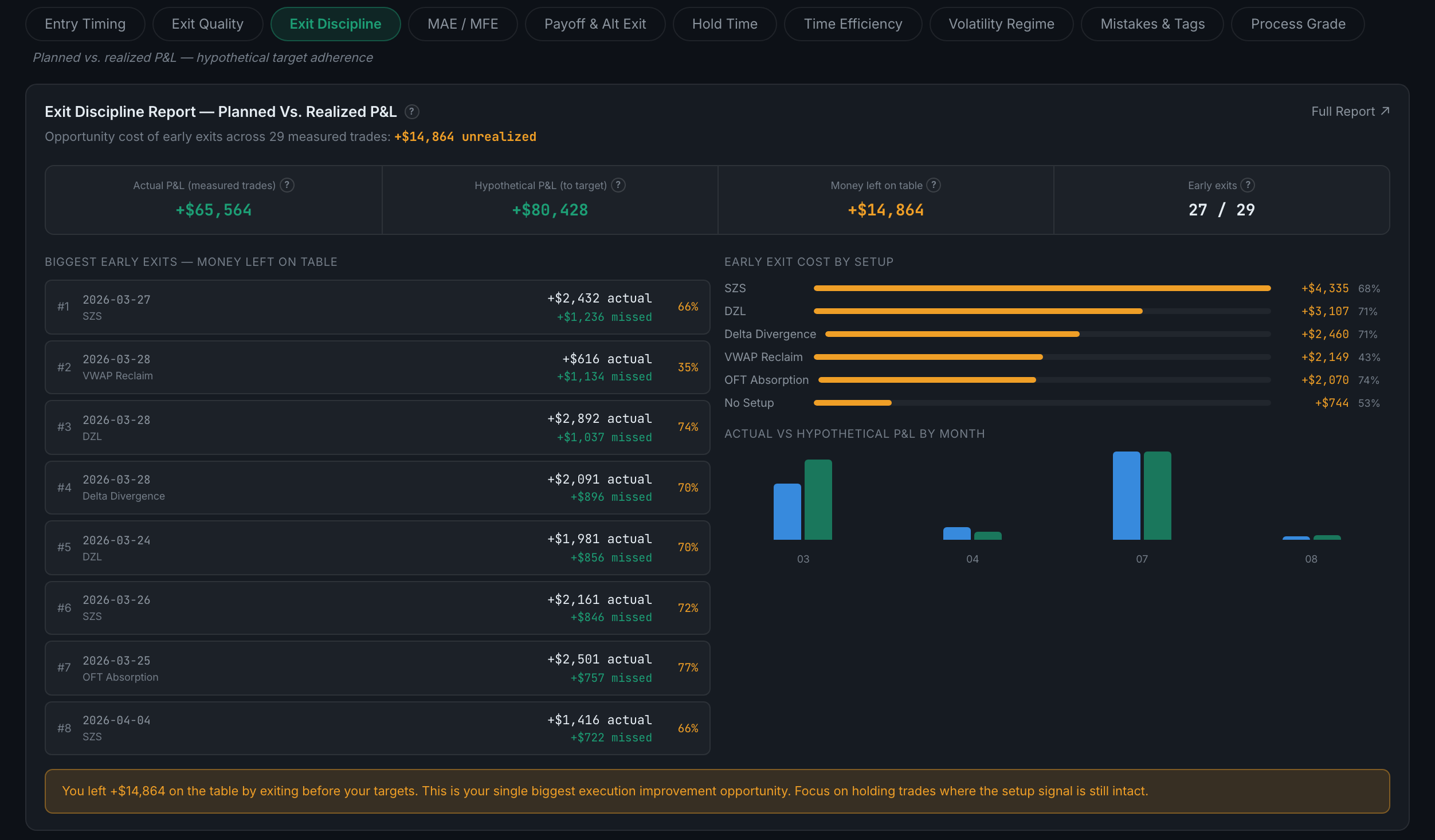
How you trade around scheduled economic events — news days against quiet days, your best and worst event types, whether the surprise direction mattered, and how long after a release you entered.
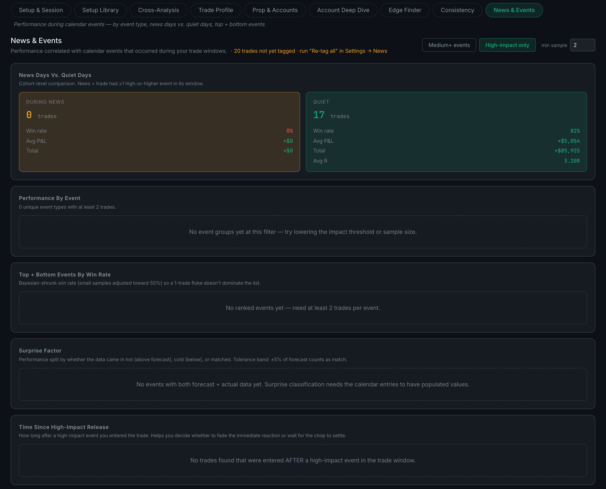
Whether you get in at a good moment — entry quality by time of day, by instrument, and a model of what better fills would have been worth.
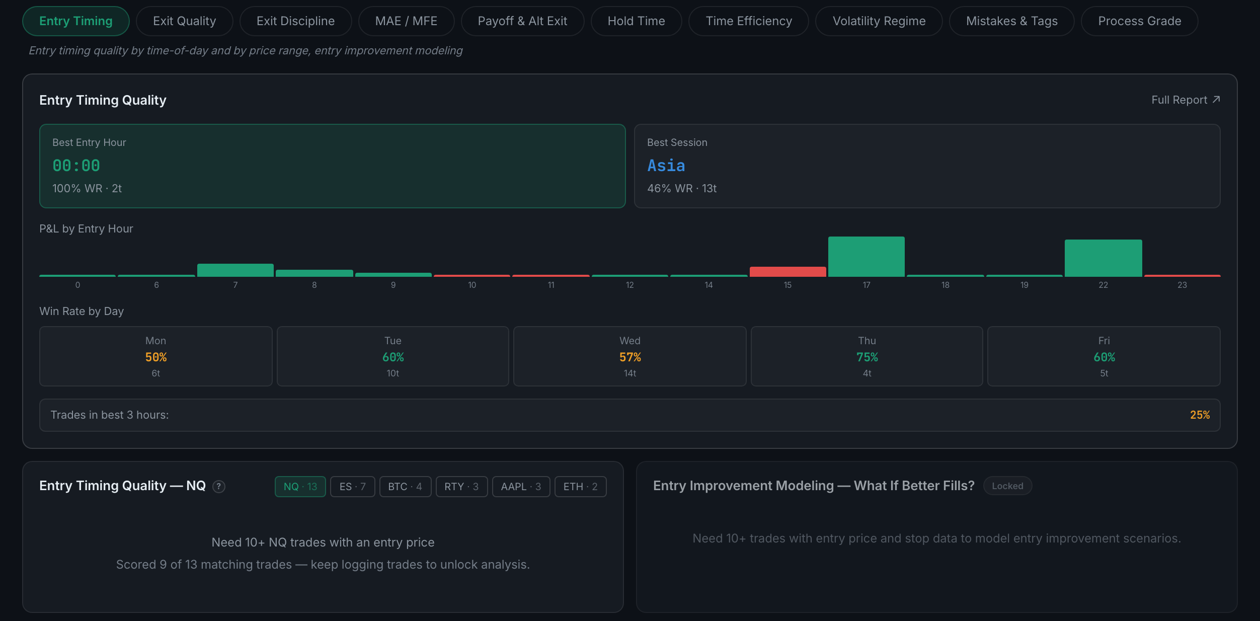
How much of each move you actually captured — exit quality, what your best exits looked like, and exit efficiency by setup.
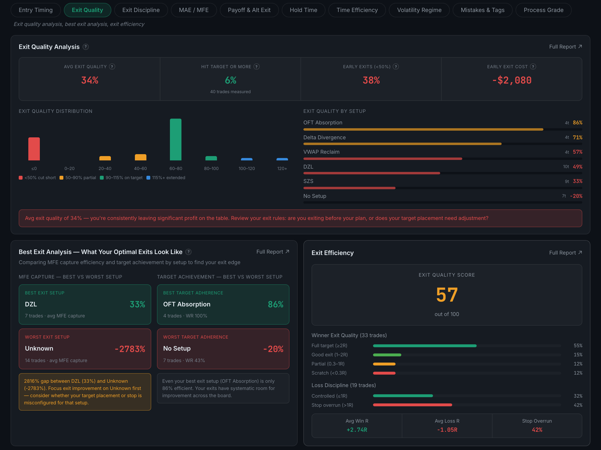
One panel. What you would have made if you had held to your written target every time, against what you actually made.
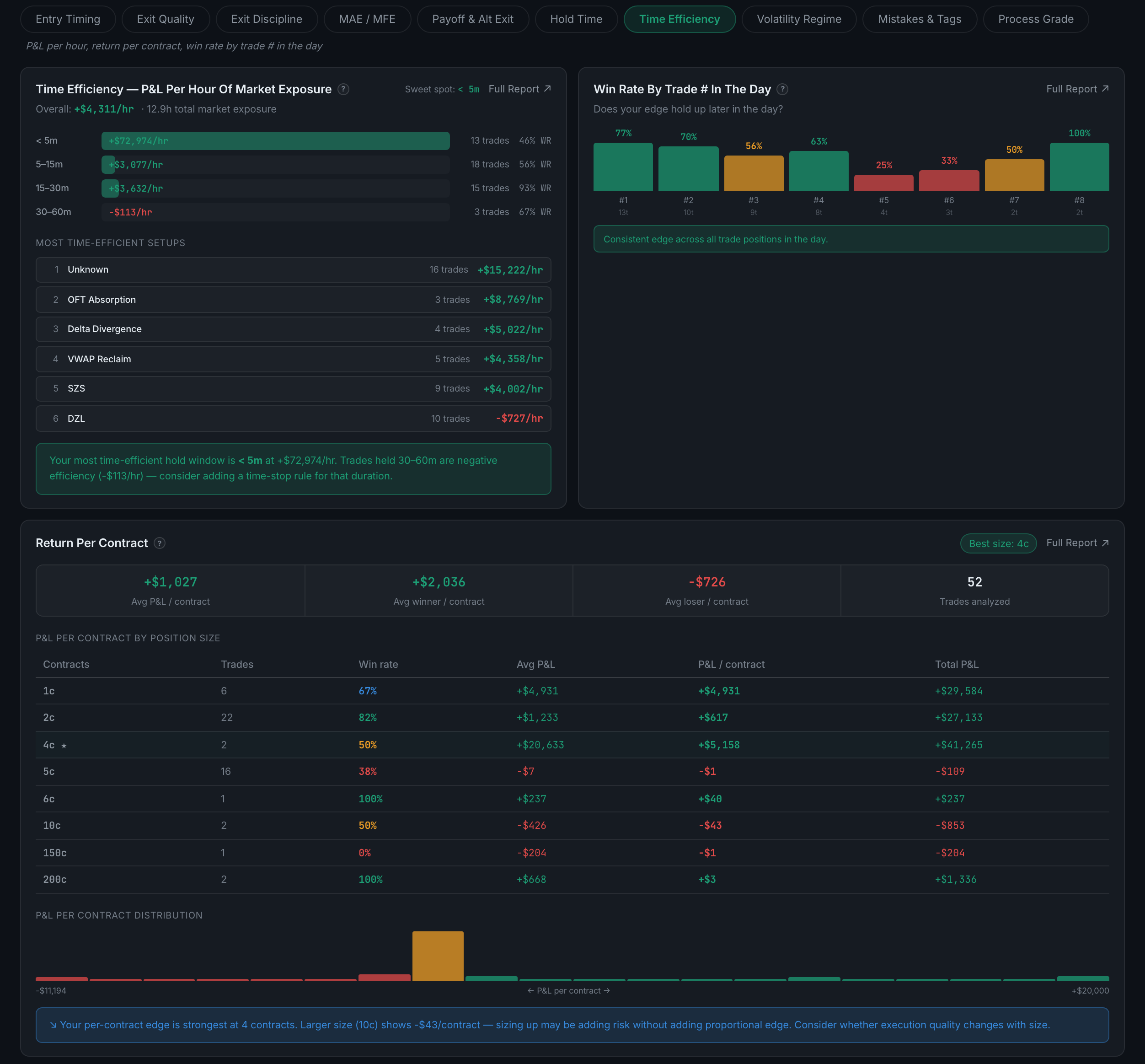
How far each trade went against you before it worked, and how far it went your way before you closed it — five panels, and five separate Full Reports.
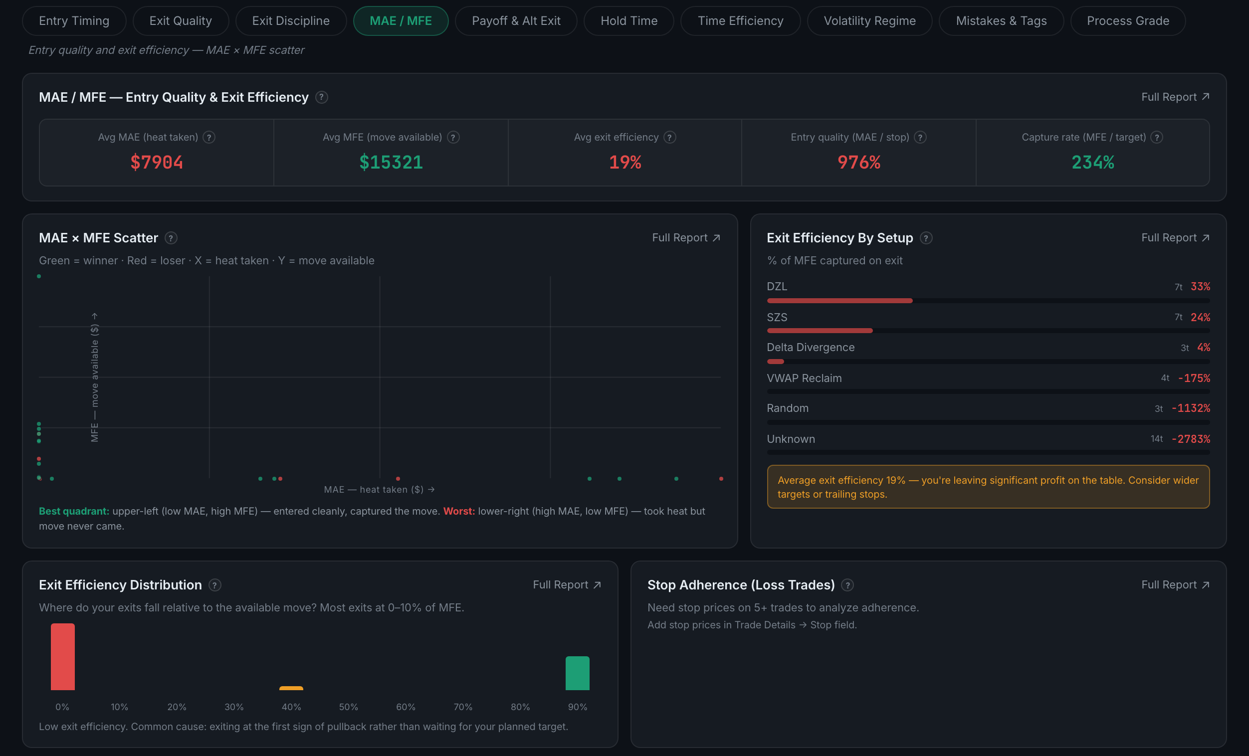
Your payoff ratio as a rolling trend, and a model of what fixed-R exits would have produced instead.
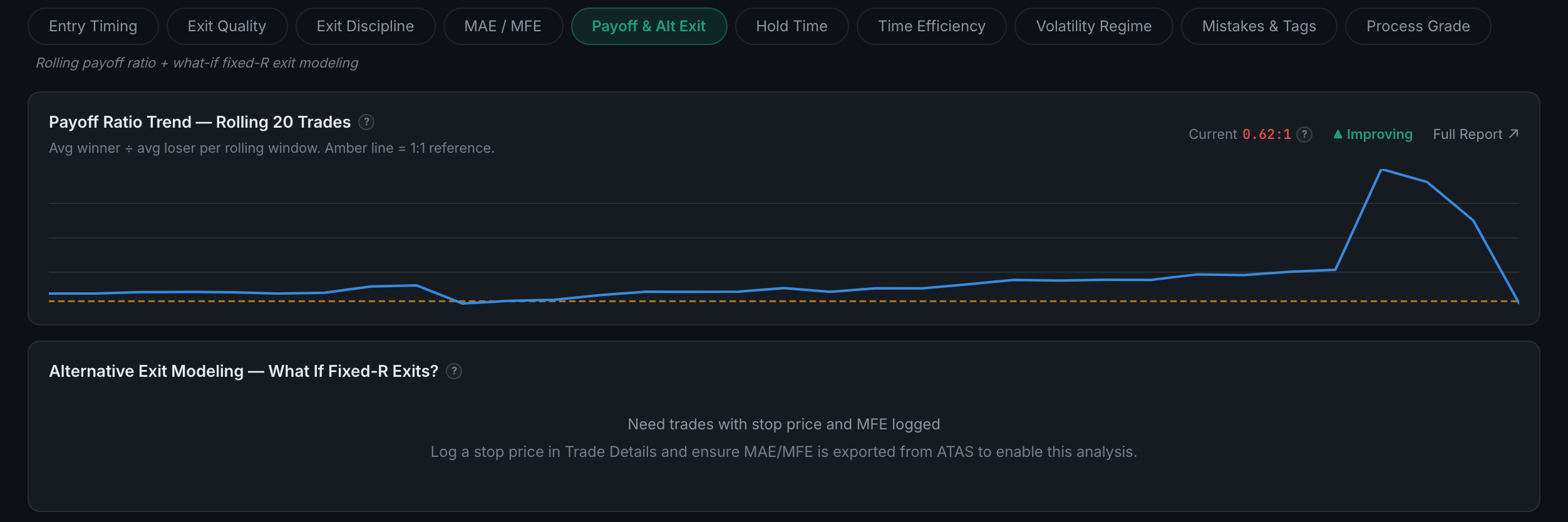
How long you hold, and what it is worth — winners against losers, a scatter, a duration breakdown and bucketed P&L.
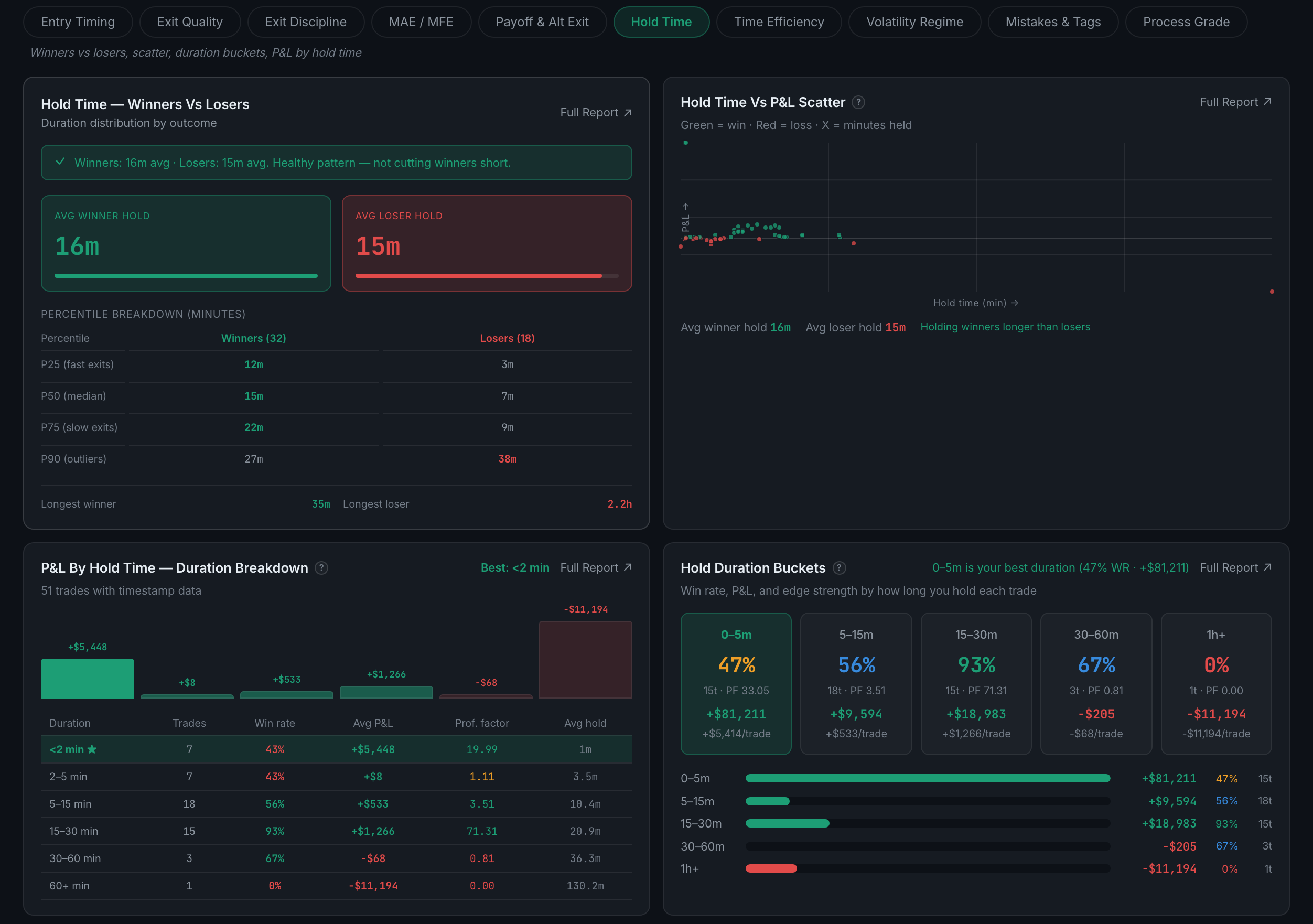
What your time and your contracts actually earn — P&L per hour of exposure, win rate by trade number in the day, and return per contract.
Whether your execution holds up when the market gets fast — results and stop adherence split by ATR regime.
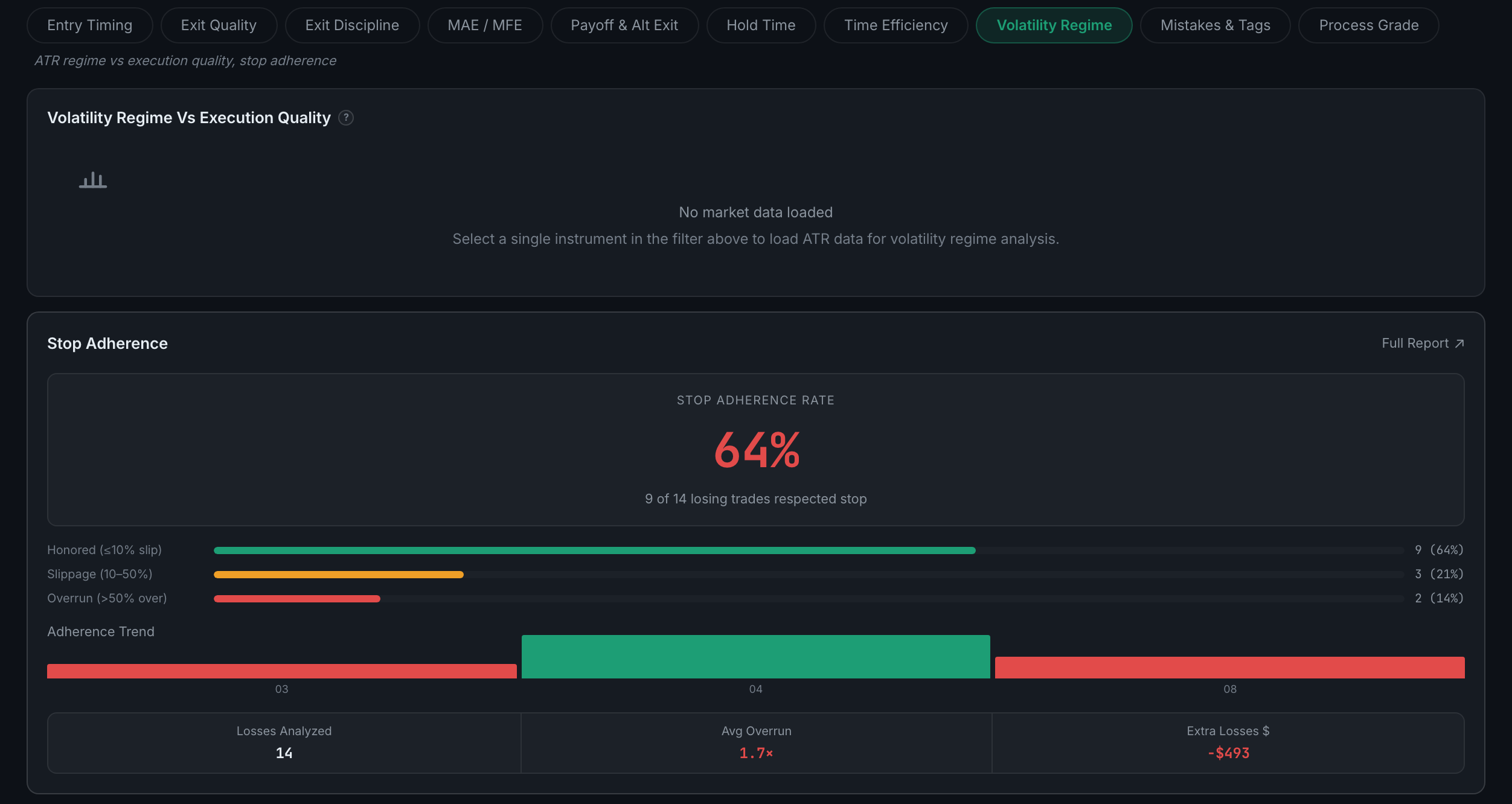
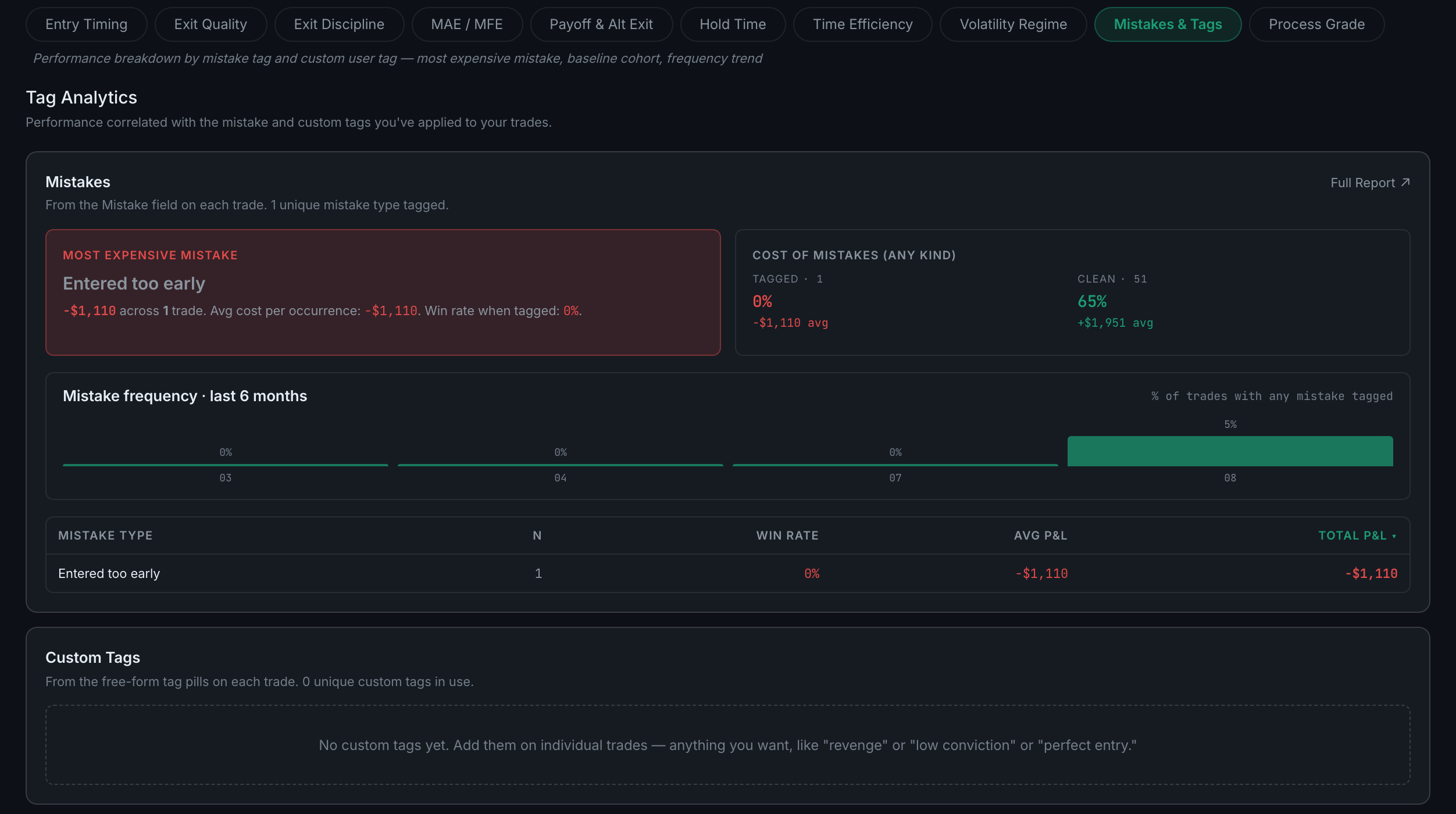
Your mistake tags and your custom tags, each priced — what each one costs, how often it happens, and whether it is getting better.
One panel, plotting how well you executed against how the trade turned out — with P&L deliberately excluded from the grade.
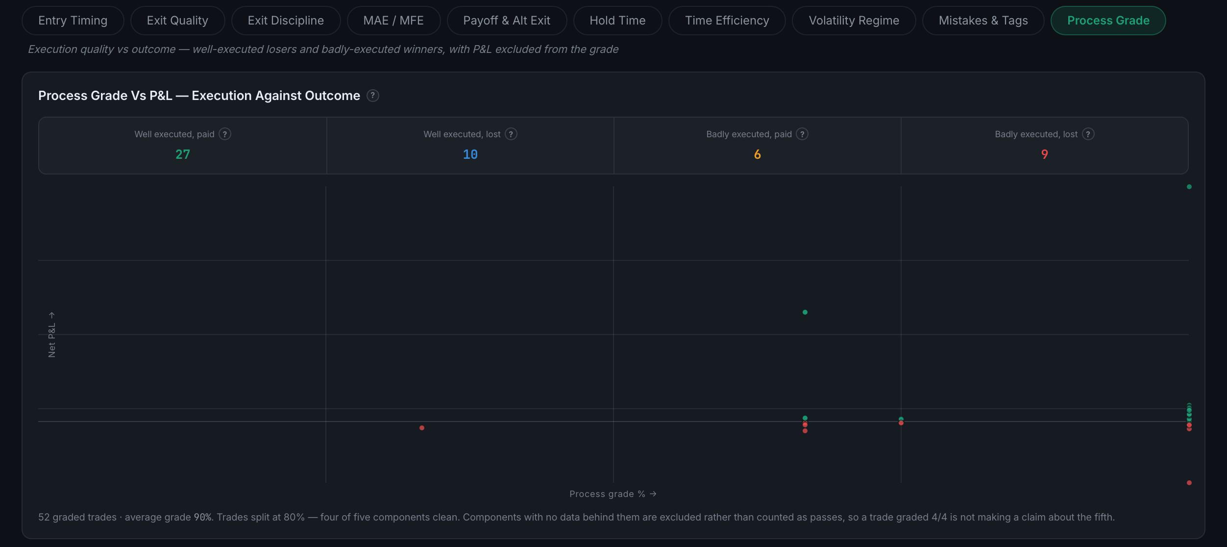
It grades how well you followed your own process on a trade, with profit and loss excluded from the calculation entirely. A well-executed loser scores 100%.
In playbook, stop predefined, size within limit, session in schedule, and stop honoured. Each lands on pass, fail, or ungradeable.
Read the full guideThe app could not tell either way, so it declined to guess. Ungradeable components are excluded from the percentage rather than counted as passes or failures.
Read the full guideBecause bar data cannot tell the difference between price trading through your stop while you watched and the market gapping past it. The component reads both as a breach.
Read the full guideHow much of the available move you actually took, expressed by sorting each exit into a quality band from full to scratch — or, on losers, controlled against overrun.
How far a trade went against you (MAE) and in your favour (MFE) before it closed. The chart needs bar data behind each trade, which not every trade has.
Read the full guideRisk is the largest tab in the app — fifteen sub-pages. They run roughly from "what has my risk actually been" through "how reliable is that number" to "what could happen next".
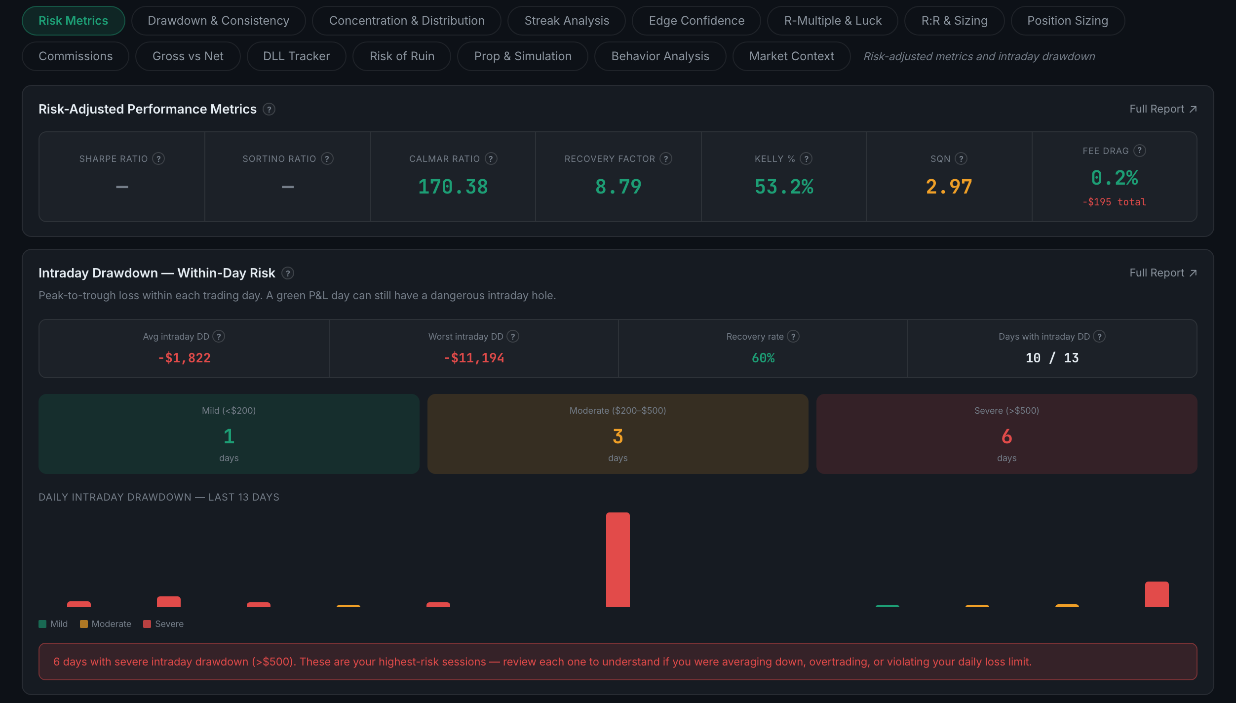
The risk-adjusted headline numbers — Sharpe, Sortino, Calmar, Kelly and recovery factor — with intraday drawdown underneath.
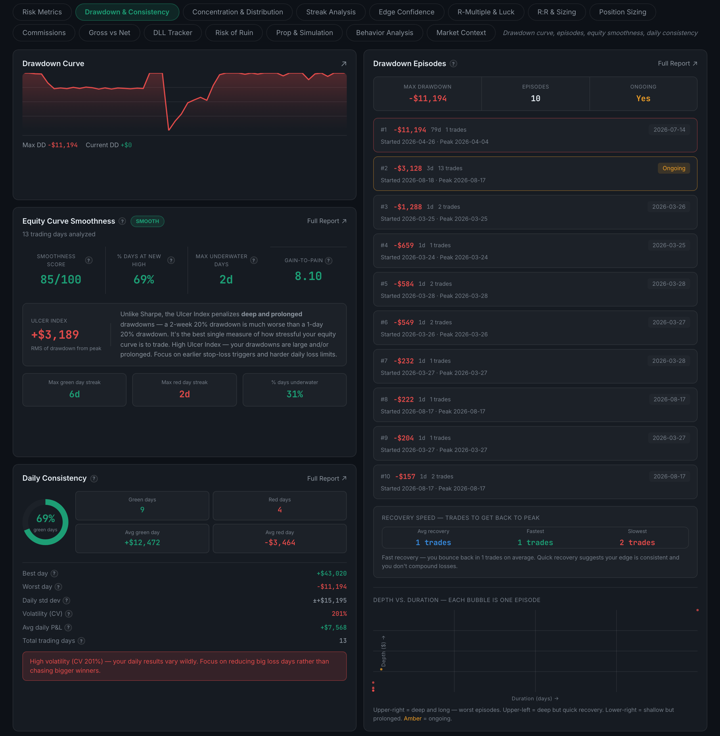
Every drawdown you have had — the curve, each episode listed separately, how smooth your equity is, and your day-to-day consistency.
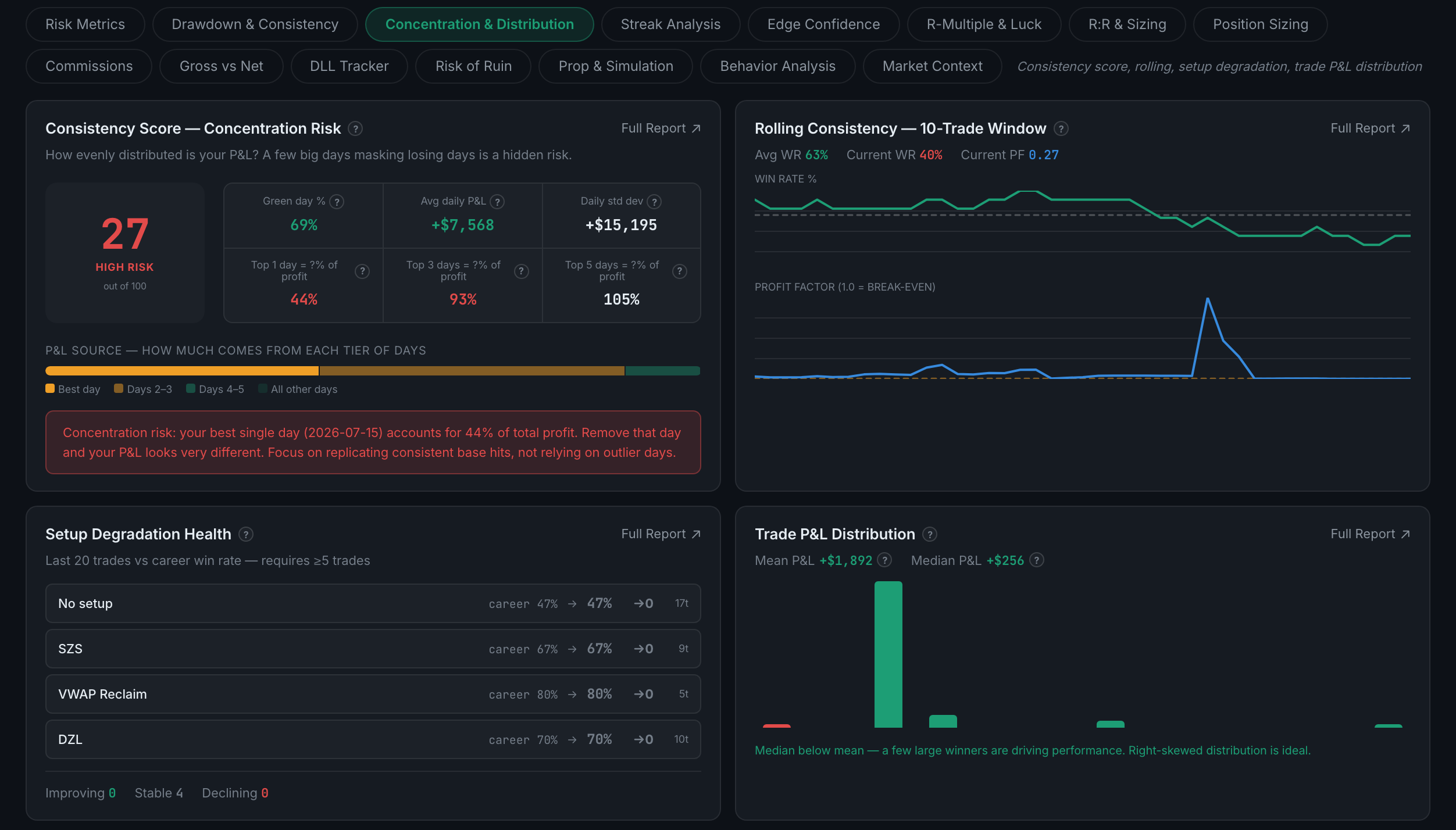
Whether your profit comes from everywhere or from one place — a concentration score, rolling consistency, setup degradation, and the shape of your P&L distribution.
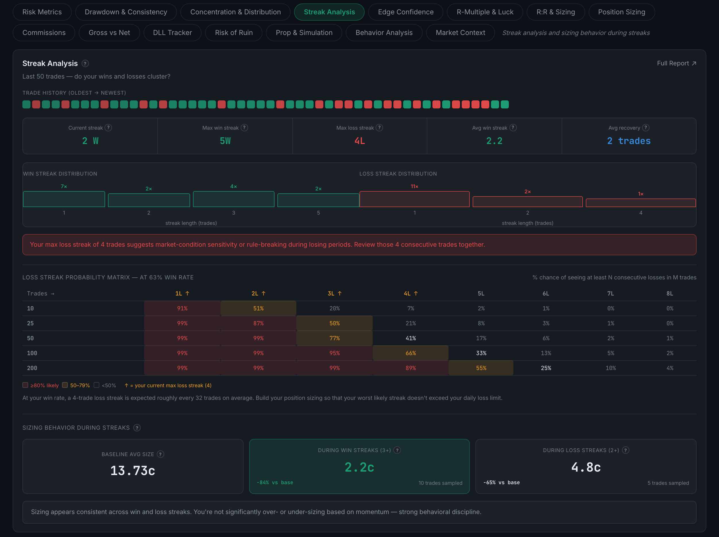
Your win and loss runs, how likely each was, and — the useful part — whether your position size changes during them.
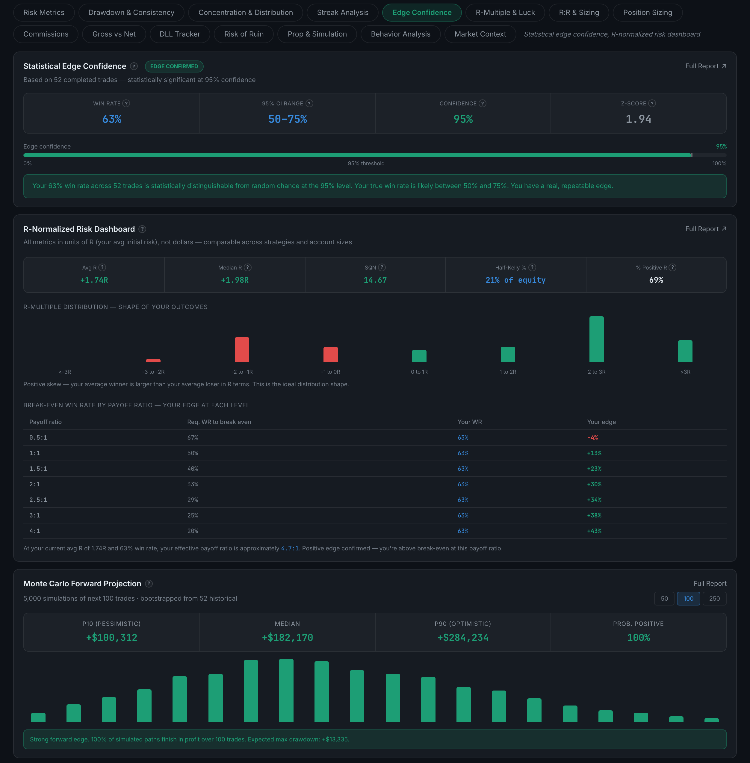
How much of your record is skill rather than sample size — a confidence interval on your win rate, an R-normalized dashboard, and a Monte Carlo projection forward.
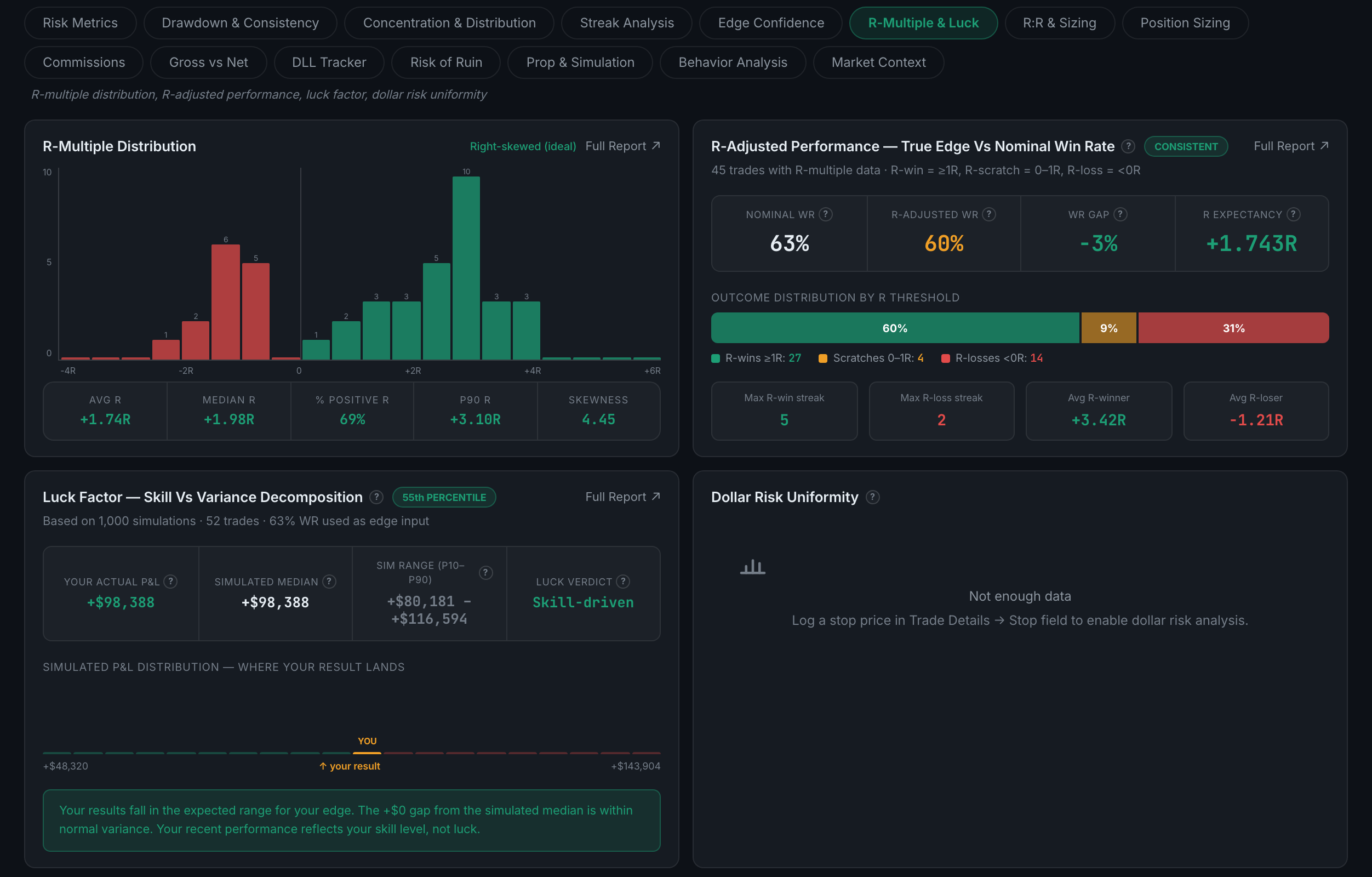
Your results measured in units of risk instead of money, and an explicit attempt to split what you earned into skill and luck.
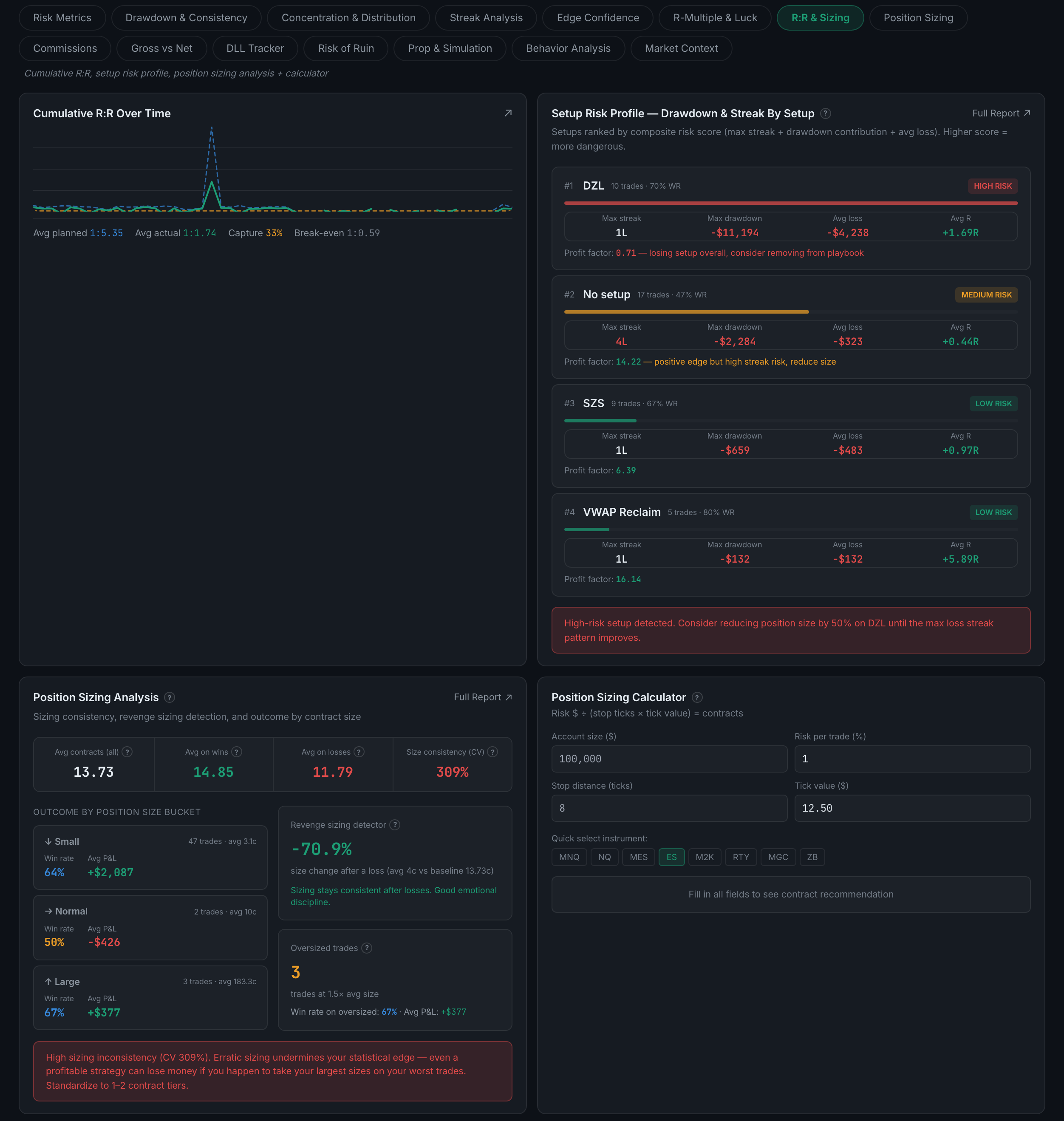
Cumulative reward-to-risk over time, a risk profile per setup, your sizing analysis, and a position size calculator you can actually use.
The deep version of sizing — dollar risk per trade, risk as a percentage, sizing discipline, leverage, and a full metrics table.

What your broker costs you — total commissions, fee drag as a share of gross, cost per trade, and how many winners the fees turned into losers.

The same costs shown as a before-and-after — what you made, what you kept, and what the difference did to individual setups.

Your daily loss limit — how close you come to it, and how often you have gone through it.
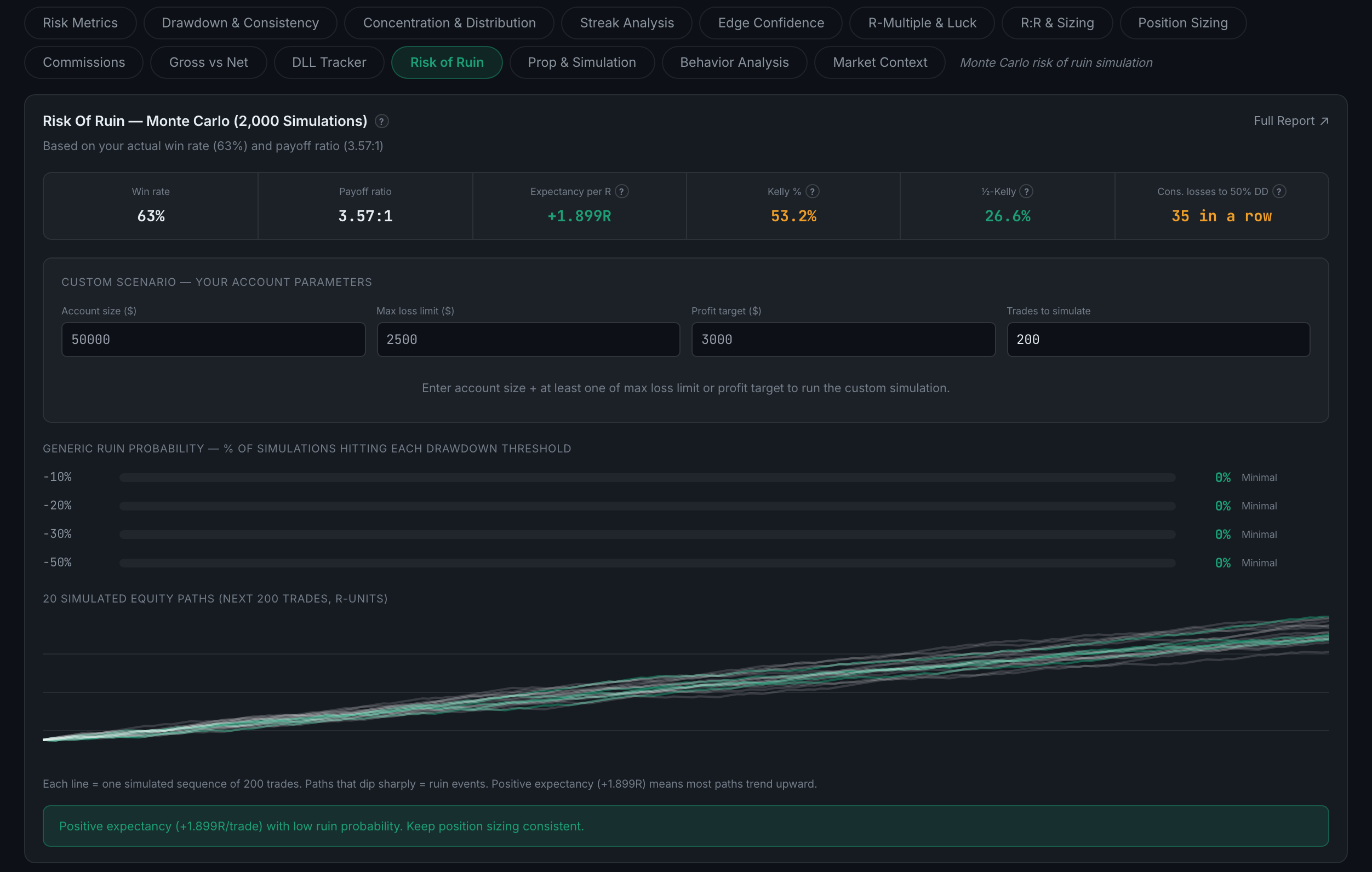
A Monte Carlo simulation — 2,000 runs — of how likely a sequence of losses is to end your account.
Your odds of passing an evaluation, an overtrading detector, and a simulation of what specific improvements would be worth.
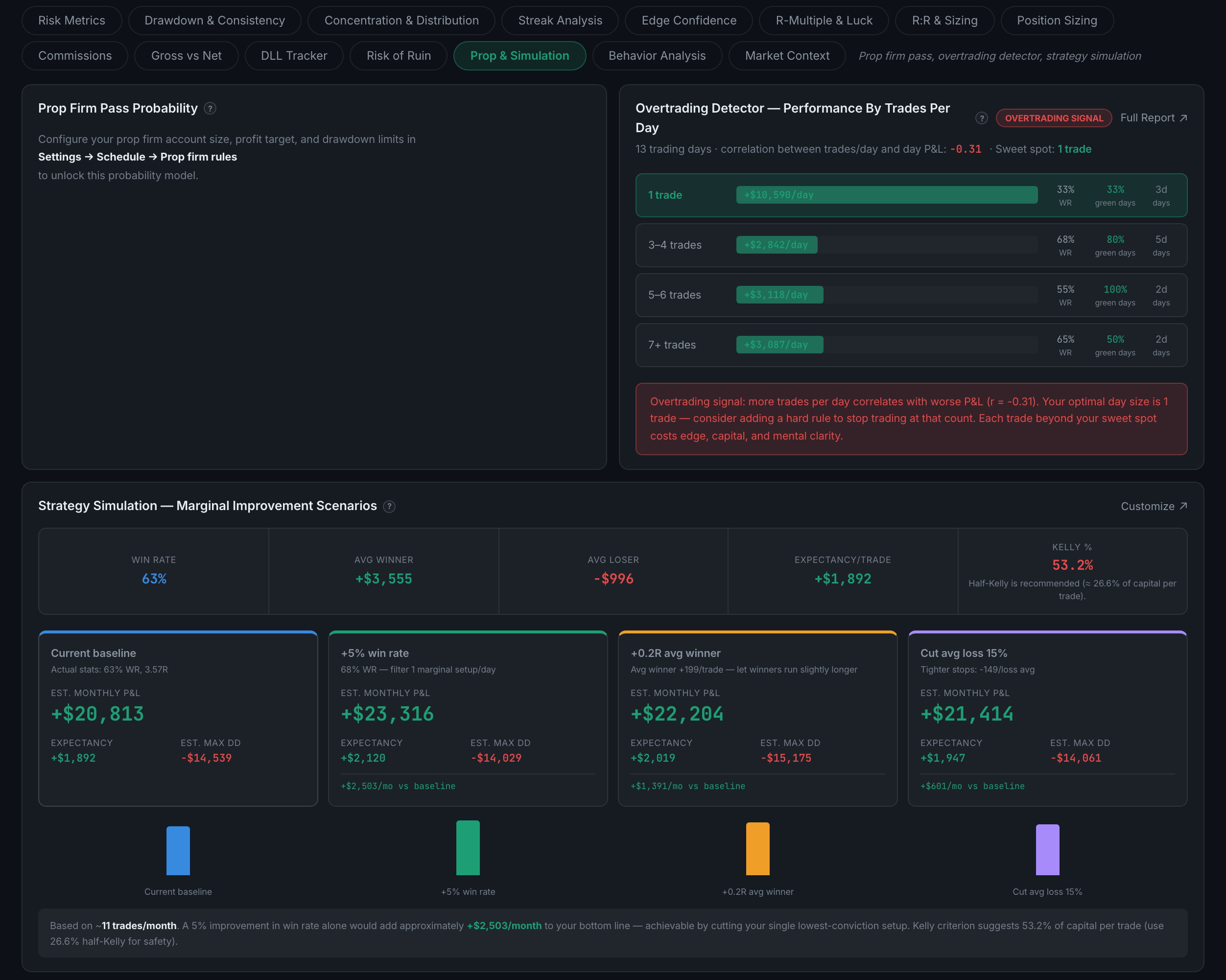
Risk-adjusted performance per instrument — which contract you actually trade well, measured by Sharpe rather than by P&L.

Your results against the market you were trading in — the index backdrop, how VIX affects your edge, and a simulation of perfect execution.
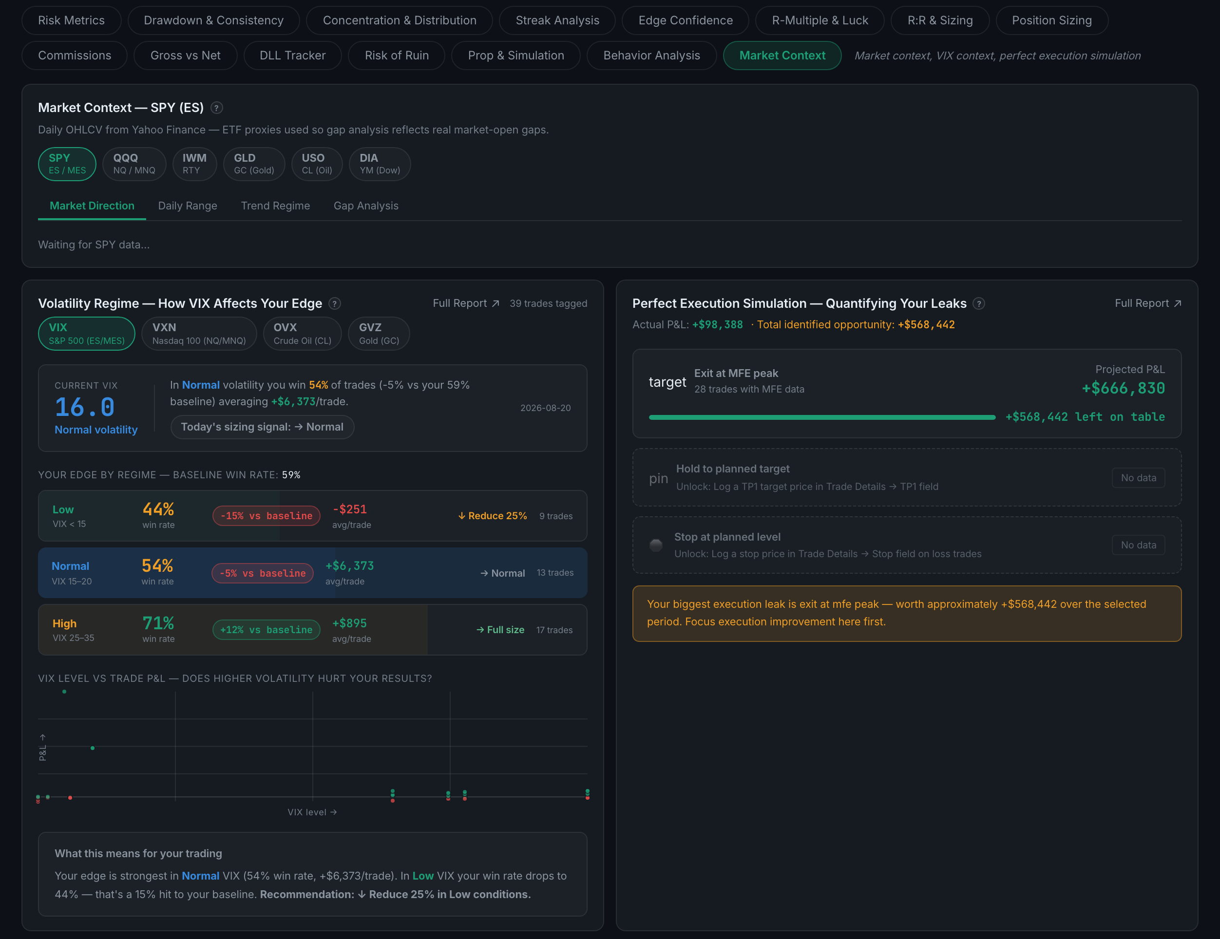
Your average daily P&L divided by how much it varies, annualised. It stays blank until you have 20 trading days, on purpose.
The share of your capital that maximises long-run growth, given your win rate and your average win against your average loss. Half of it is the number to actually use.
Read the full guideA Monte Carlo simulation of how likely a run of losses is to wipe out your account, given how you actually trade.
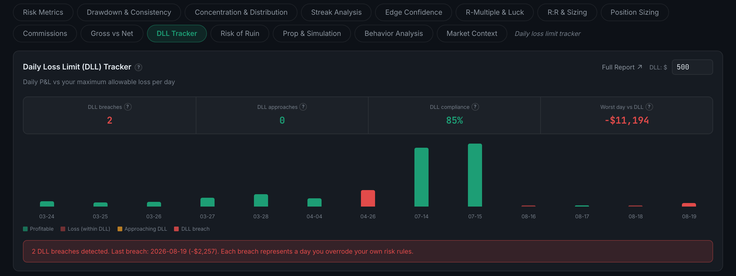
Daily loss limit tracking — how close you come to your worst-allowed day, and how often you have gone past it.
Read the full guideSix sub-pages, and every one of them is built from your debriefs and check-ins rather than from your fills. This is the only tab whose inputs are entirely your own writing, which is why it is the tab most likely to be empty and the tab most likely to tell you something you did not already know. It also carries more Full Report buttons than any other.
The positive half of the psychology picture — which mental factors predict your good days, how your scores are trending, and what your best state actually looks like.
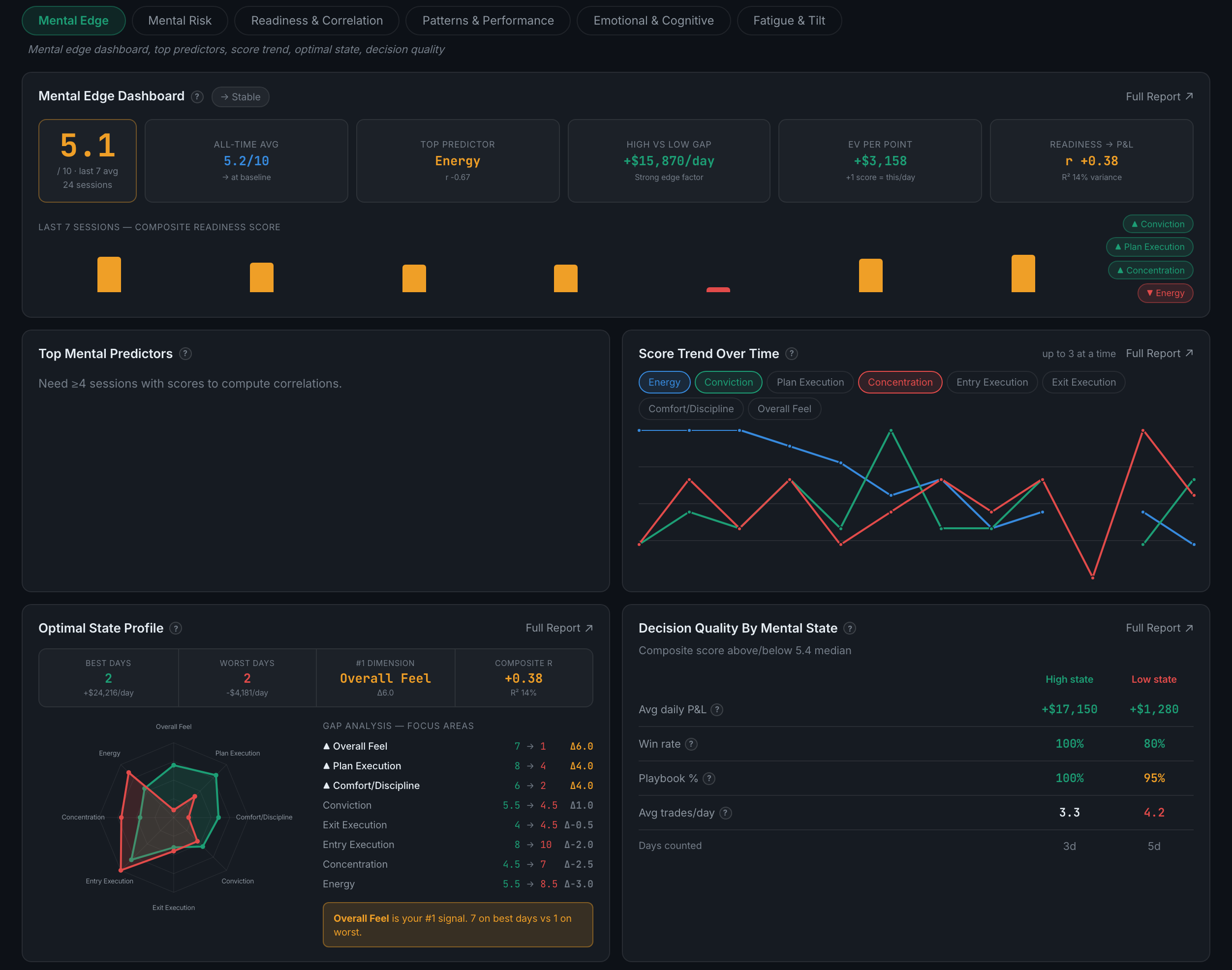
The failure modes — tilt, fatigue, revenge trading, session fade, and a calendar of how ready you were each day. Eight panels, the most of any sub-page in the tab.
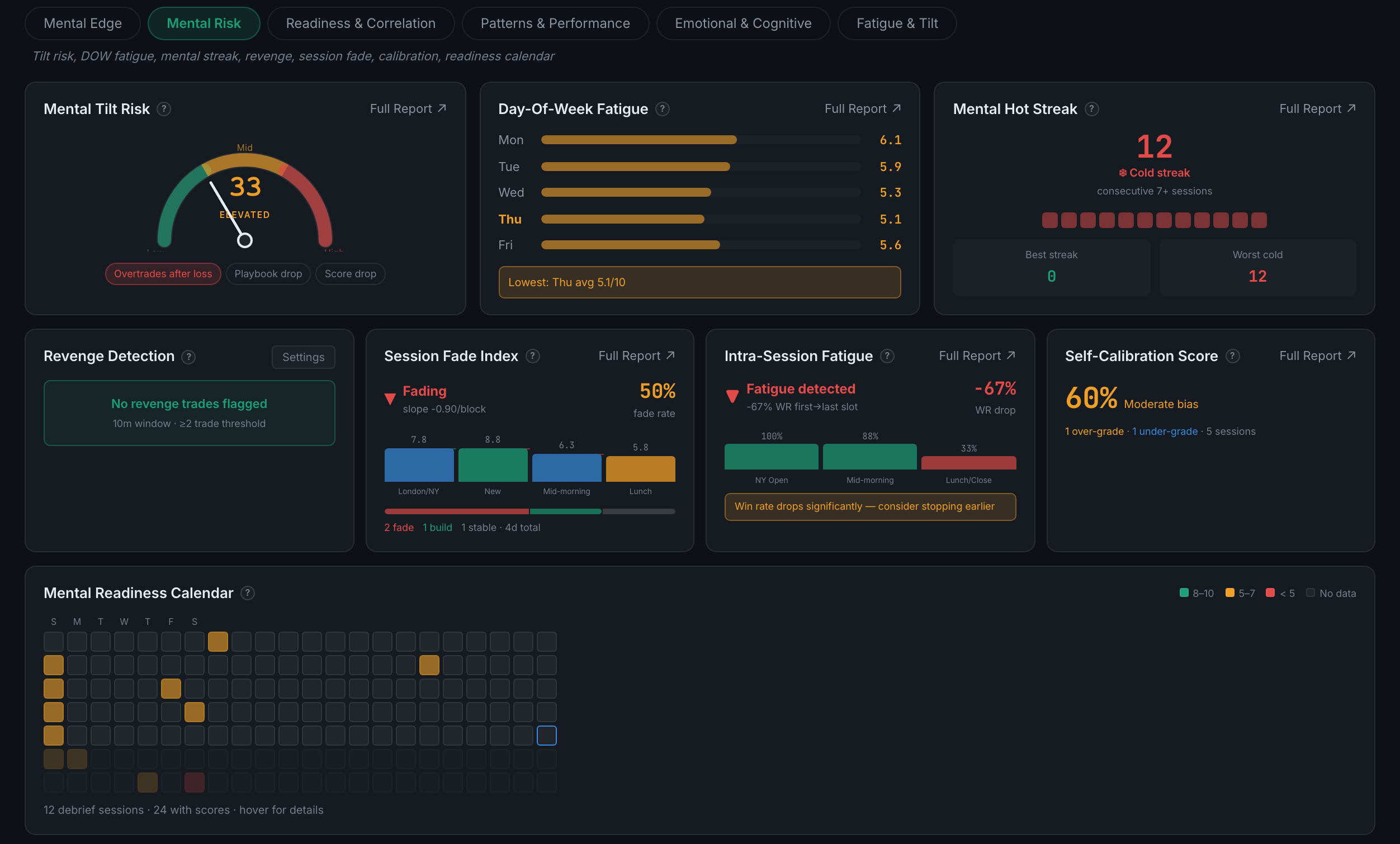
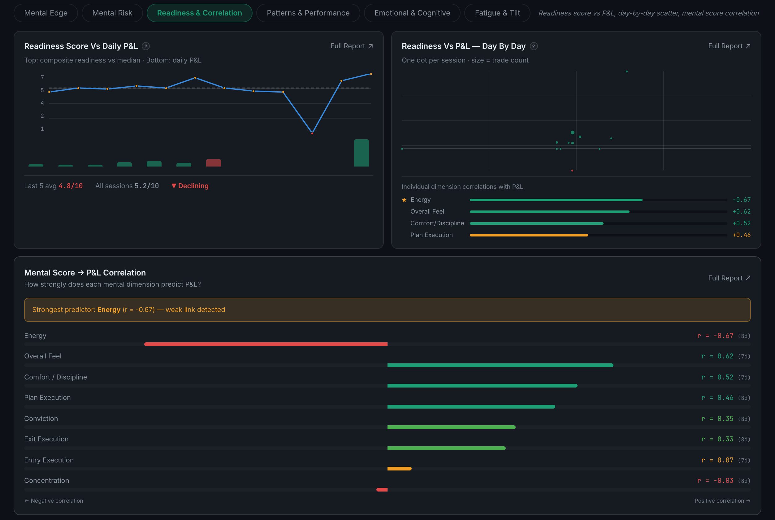
Does your pre-market readiness score actually predict the day — plotted three ways.
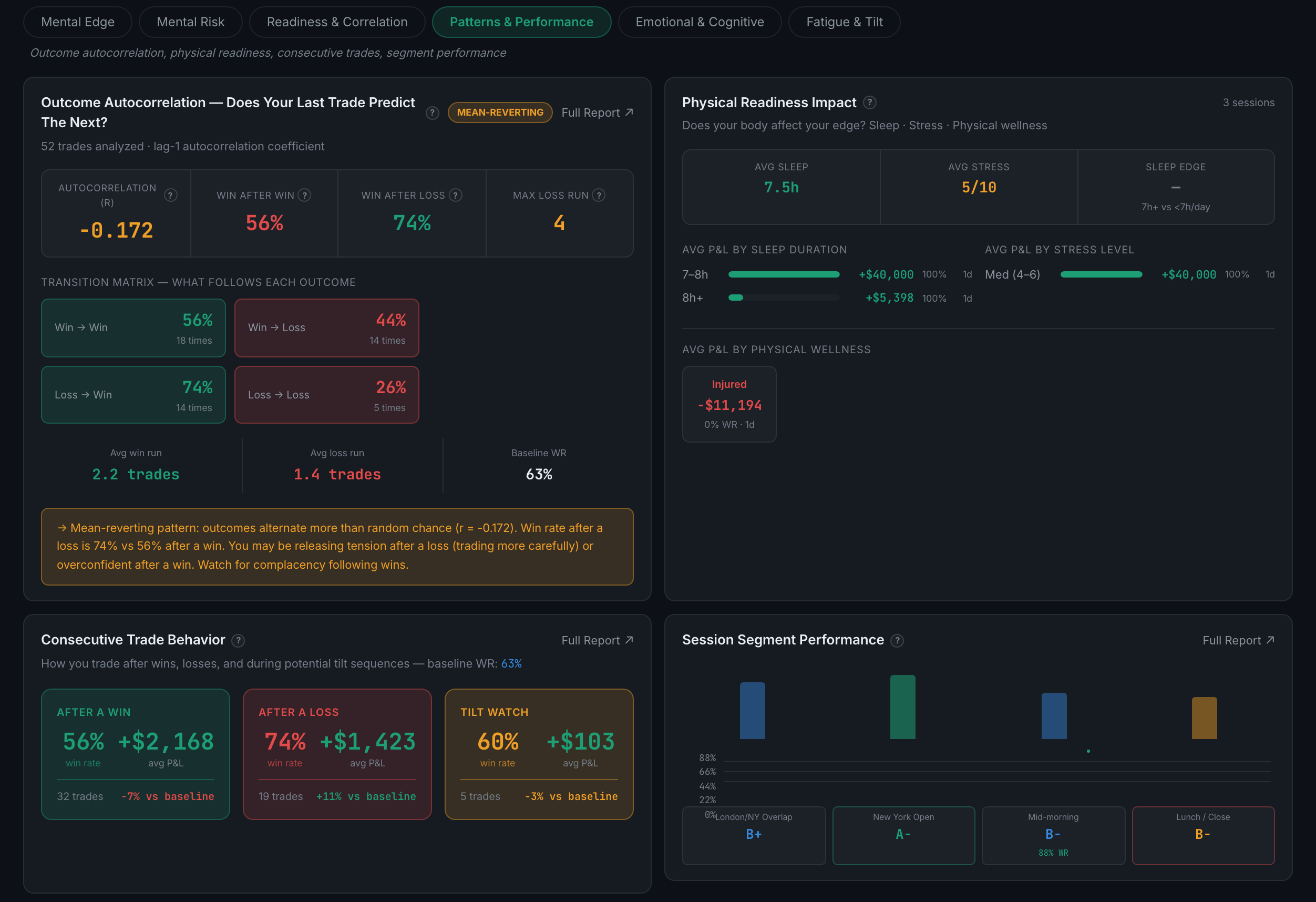
Whether one trade affects the next — autocorrelation, physical readiness, what you do after a win or a loss, and how you perform across the segments of a session.
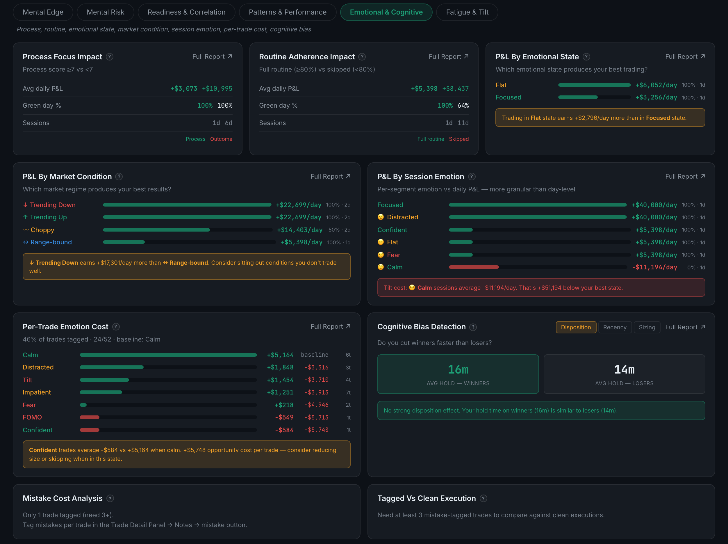
Nine panels on what you felt and what it cost — emotional state, market condition, process focus, routine adherence, per-trade emotion cost and cognitive bias detection. Seven Full Reports, the most in the app.
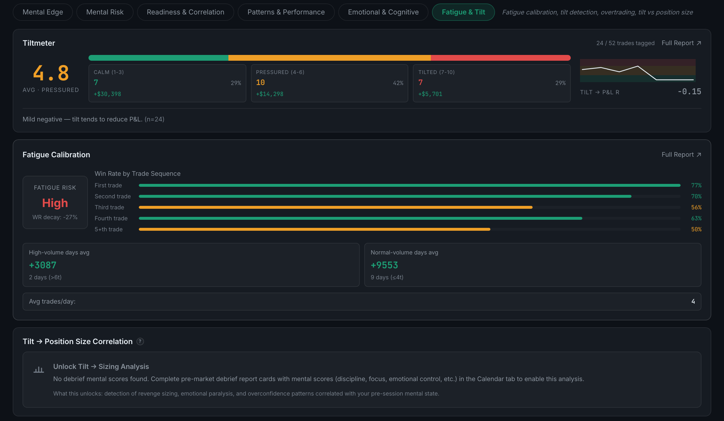
A tilt meter, a check on whether your fatigue self-scores are accurate, and the correlation between tilt and how big you go.
Your debriefs. Mental scores, physical readiness and routine come from the daily report card; emotion and mistake tags come from the trades themselves.
Read the full guideBecause there are no debriefs with scores behind it. The app asks for at least two debrief sessions with scores filled in.
Read the full guideMental Edge is what your good days have in common. Mental Risk is what your bad ones do — tilt, fatigue, revenge and overtrading.
Four panels — a performance summary, a per-setup deep dive, your trade log, and a report builder that will slice your record by setup, session, day or time — plus CSV and PDF export.
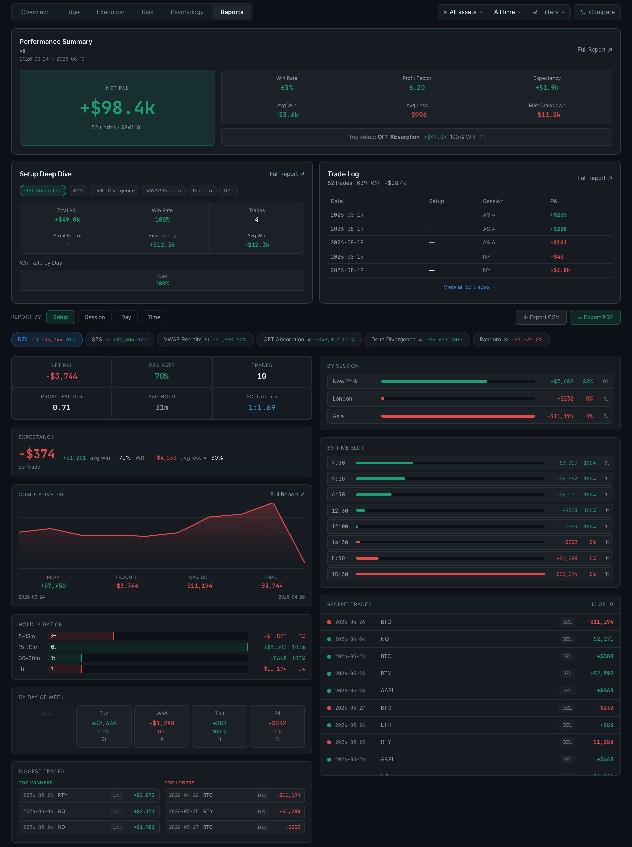
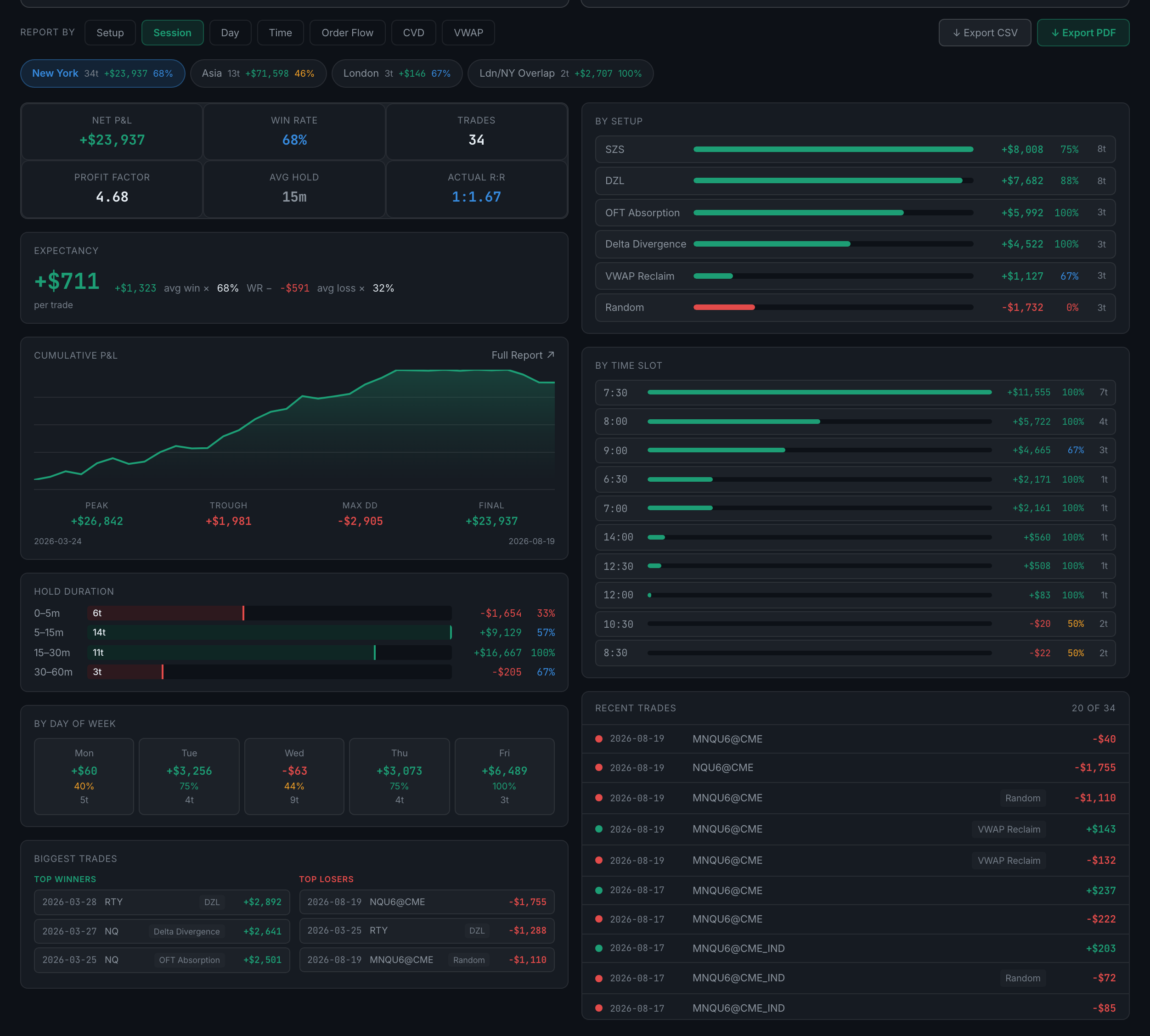
Use the Report by row at the bottom of Reports. Pick a dimension — setup, session, day, time, or any custom column of your own — pick a value, and the panel below becomes a full dossier on just those trades.
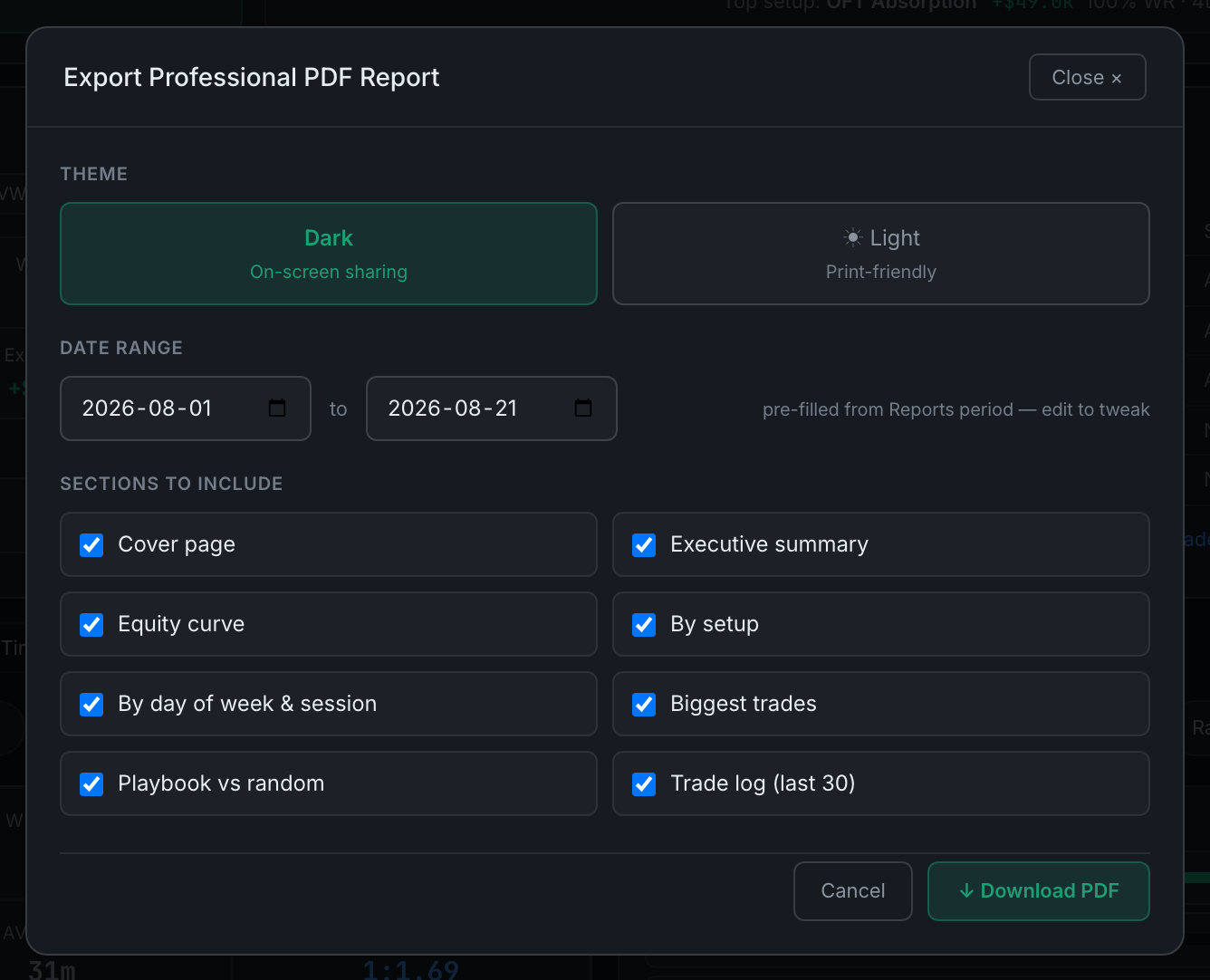
Both buttons sit at the right of the Report by row. CSV exports the trades currently selected; PDF opens a dialog where you choose the date range, the theme and which sections to include.
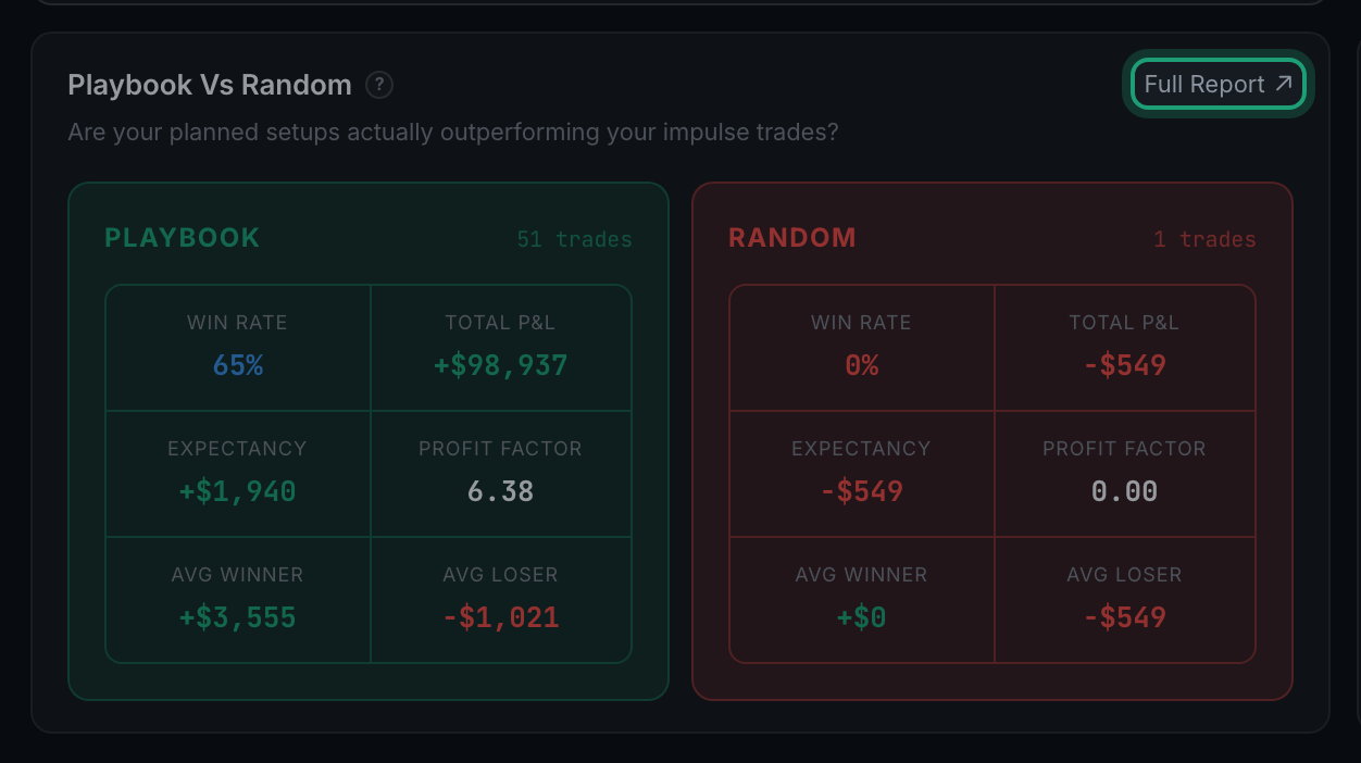
Almost every panel in Analytics has a small Full Report ↗ in its top-right corner. It opens the same numbers again, but worked all the way through — the full table, a plain-language verdict, and the reasoning behind the reading.
Four things, in the same order every time — a row of headline figures, the full table behind the chart, a colour-coded verdict, and research notes on how to read the metric.
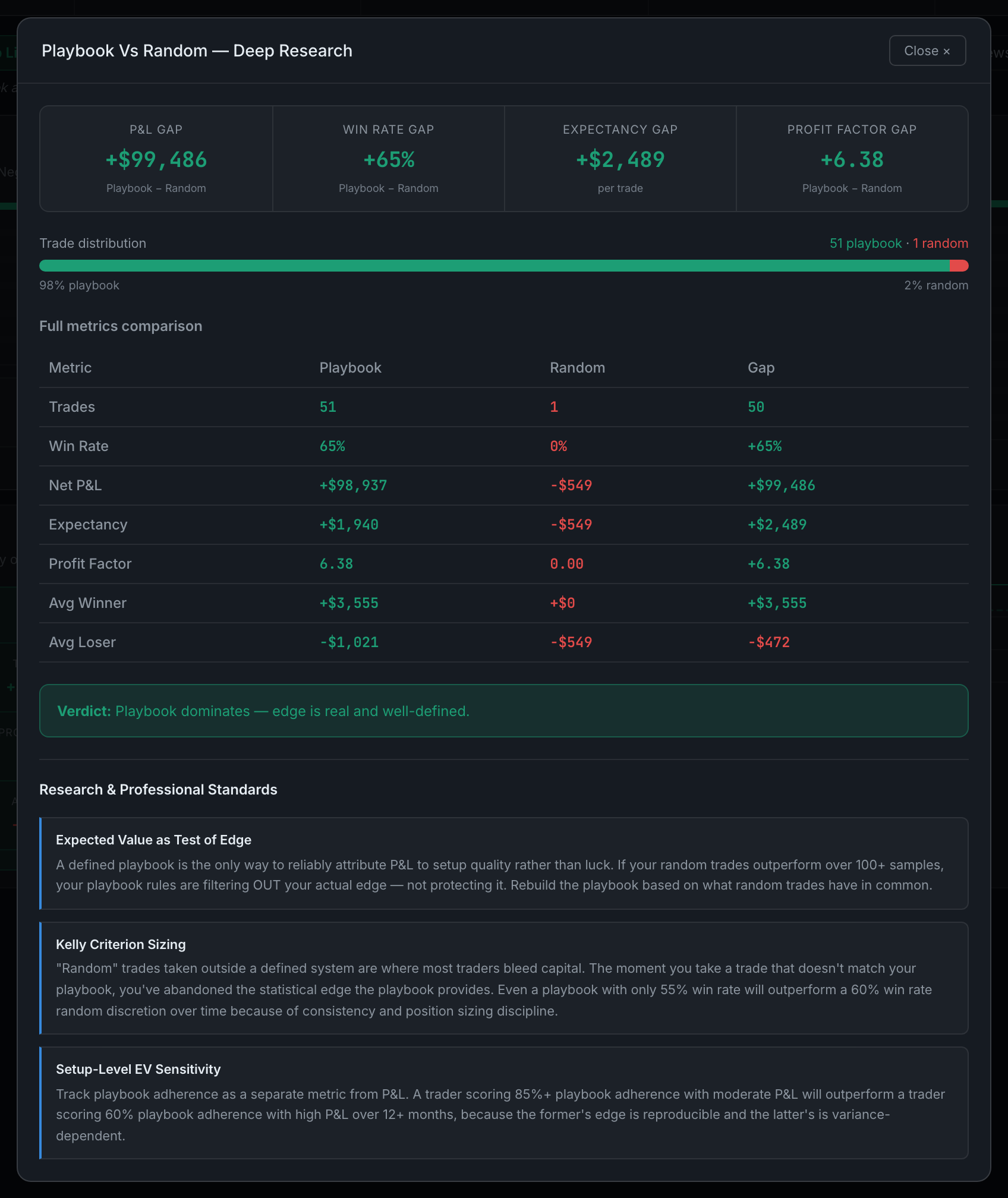
Around sixty-five different reports, spread across all five working tabs. On a well-filled account roughly ninety Full Report ↗ buttons are live at once.
Read the full guideBecause a field it needs is empty, or you have not traded enough yet. It is a data gate, never a paywall — the grey Locked pill always comes with a line telling you exactly what would unlock it.
