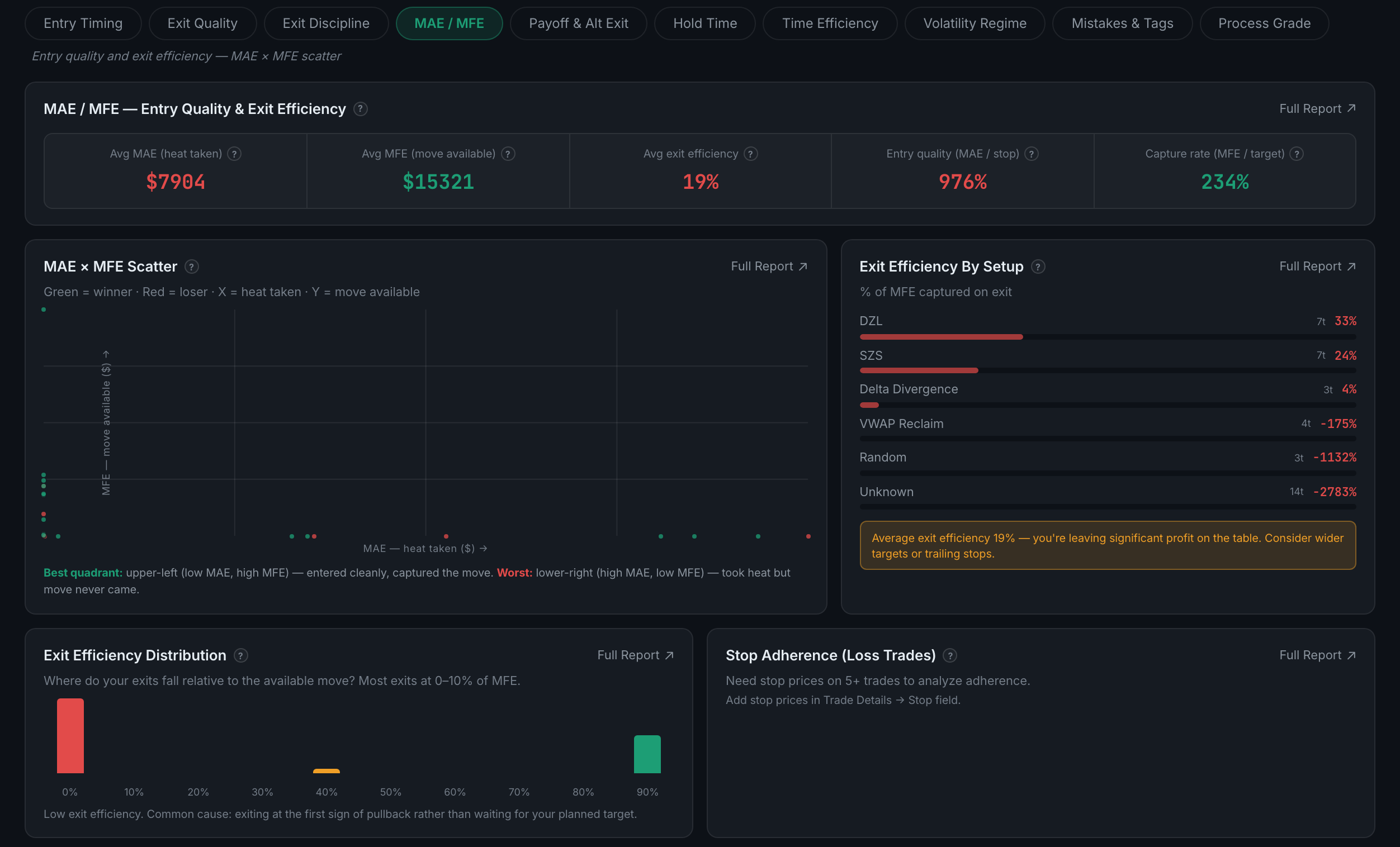
What is on the MAE / MFE sub-page?
How far each trade went against you before it worked, and how far it went your way before you closed it — five panels, and five separate Full Reports.
MAE is maximum adverse excursion, the worst point of the trade. MFE is maximum favourable excursion, the best. Together they separate two things P&L cannot: whether your entries are well-timed, and whether your exits capture what the entries earn.
Indicators on this sub-page:
- MAE / MFE — Entry Quality & Exit EfficiencyFive figures: average MAE labelled heat taken, average MFE labelled move available, average exit efficiency, entry quality as MAE against your stop, and capture rate as MFE against your target.
- MAE × MFE ScatterEvery trade as a point, heat taken along the bottom, move available up the side, green for winners and red for losers. The legend names the quadrants for you: upper-left is the good one — entered cleanly and captured the move; lower-right is the bad one — took heat and the move never came.
- Exit Efficiency by SetupThe share of the available move you captured, per setup, with a trade count each and a verdict underneath. Expect some very odd numbers here: an untagged cohort showing −2783% is a handful of trades where the move went the other way, not a finding about a setup.
- Exit Efficiency DistributionWhere your exits fall across 0–100% of MFE. Two humps means you are running two different exit behaviours without having decided to; a spike at 0–10% has its own diagnosis printed under the chart.
- Stop Adherence (loss trades)On losing trades only, whether the stop was honoured. Needs stop prices on five or more trades, added in Trade Details → Stop.
Every one of those five panels has its own Full Report, which is unusual — most sub-pages carry one or two. Excursion data needs a connected broker; without it the panels say so rather than drawing an empty chart.