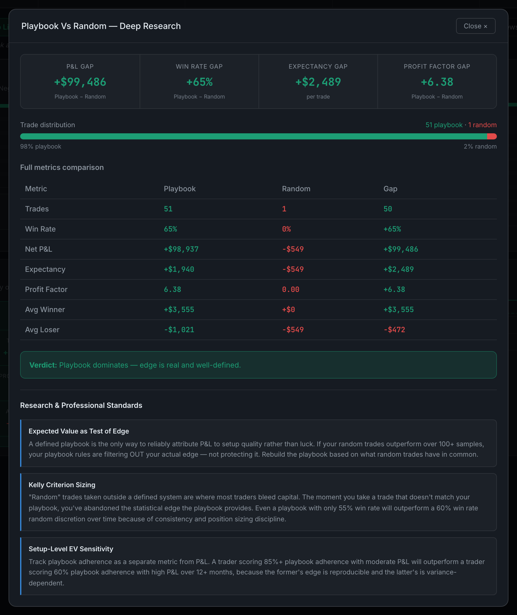
What is inside a Deep Research report?
Four things, in the same order every time — a row of headline figures, the full table behind the chart, a colour-coded verdict, and research notes on how to read the metric.
The layout is deliberately identical from report to report, so once you have read one you can skim any of the others.
- The headline row. Three to five large figures across the top, and these are usually gaps rather than raw totals — "P&L Gap", "Win Rate Gap", "Expectancy Gap" — because the comparison is the point. Green means the first thing beat the second; red means it did not.
- The full breakdown. The panel shows the top five; the report shows everything, with a Gap column so you are not subtracting in your head. Where a split is involved there is also a share bar showing how the trades divided between the two sides — a 40-trade edge over three trades is not the same finding as a 40-trade edge over forty.
- The verdict. One boxed sentence, coloured green, amber or red, saying what the numbers add up to. It is written to be blunt: "Random outperforms playbook — warning sign" is a verdict the app will actually give you.
- Research & Professional Standards. Two to four short notes at the foot, each with a named principle — "Kelly Criterion Sizing", "Why R-Multiples Beat Dollars", "Tom Hougaard — Best Loser Wins" — explaining what the metric is for and where it misleads. These are written reference notes, the same for everyone; they are not generated from your trades.
The verdict and the notes are the part worth reading twice. The figures tell you what happened; those two tell you whether it means anything yet.